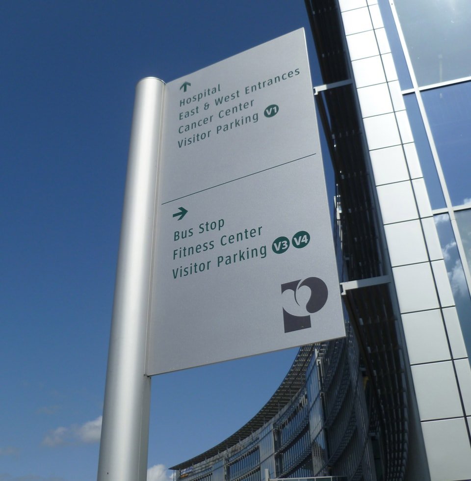
Healthcare spaces are large, confusing and often in a constant state of movement. Whether you’re going to the hospital for an emergency, an appointment, or to visit someone, finding your way around a hospital can be a stressful experience.
Static maps and signs are often confusing and ineffective at leading visitors to their destination, and while staff and volunteers can show visitors around, this takes valuable time away from hospital staff.
How might we improve the healthcare experience of patients and visitors and help them access care easily?
Talking to stakeholders
After defining the target audience to include both patients and visitors. In order to understand what was working in the existing wayfinding system and what could be improved, I conducted a user survey of the target audience. By doing this, I was also able to capture how they used existing wayfinding systems.
Some of the major pain points were:
“Digital kiosks helped show routes. But with longer routes and confusing hallways, it was easy to forget information halfway to the destination.”
“The maps at the entrance weren’t enough. I had to stop and ask the hospital staff for directions.”
“Too many sections and not enough signs.”
How do we navigate?
According to Neural systems for landmark-based wayfinding in humans, we use landmarks during wayfinding to determine where they are in the world and to guide their way to their destination. To implement this strategy, known as landmark-based piloting, a navigator must be able to:

Landmark recognition
Identify individual landmarks as an abstract indicator of a place
Long term spatial knowledge
Access long-term knowledge about the spatial relationships between locations
Localization and Orientation
Use these landmarks to determine their current position and heading

Navigation
Use this knowledge to plan a route to their navigational goal
Site research
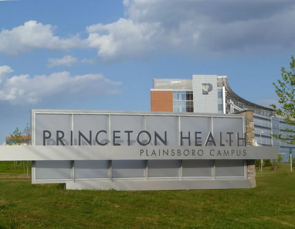
To gain a deeper understanding of user needs, I visited the Princeton Medical Center and the Brooklyn Hospital. Both spaces had adequate signage directing visitors at the entrances but after a few turns, navigation got a bit tricky. I was able to locate a digital kiosk at the Princeton Medical Center but due to hallway closures and a detour, I had to ask for help from hospital staff.
Solutions on the market
I conducted a comparative analysis based on experience and functionality of the following products: Google Maps, Vera Virtual Concierge, HotStepper, Stardust World Scale AR, Experience Q, Yahoo Maps and Localscope.
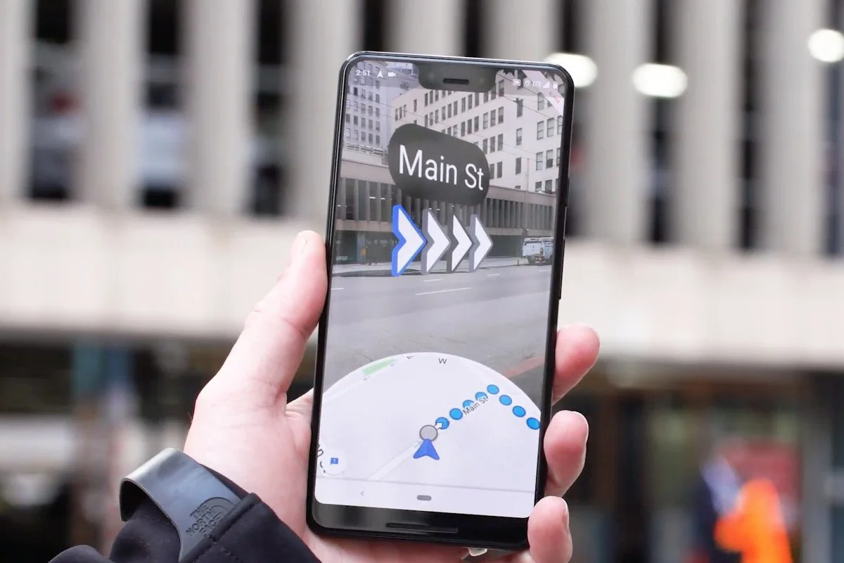
Google Maps
Familiar interface, reminds users to put their phones down while they walk, displays arrows during moments of confusion
Yahoo Maps
Superimposes blue pathway onto the physical world to indicate route, uses footprints to mark route travelled

Stardust World Scale AR
Provides sufficient context cues, allows anyone to remotely add content
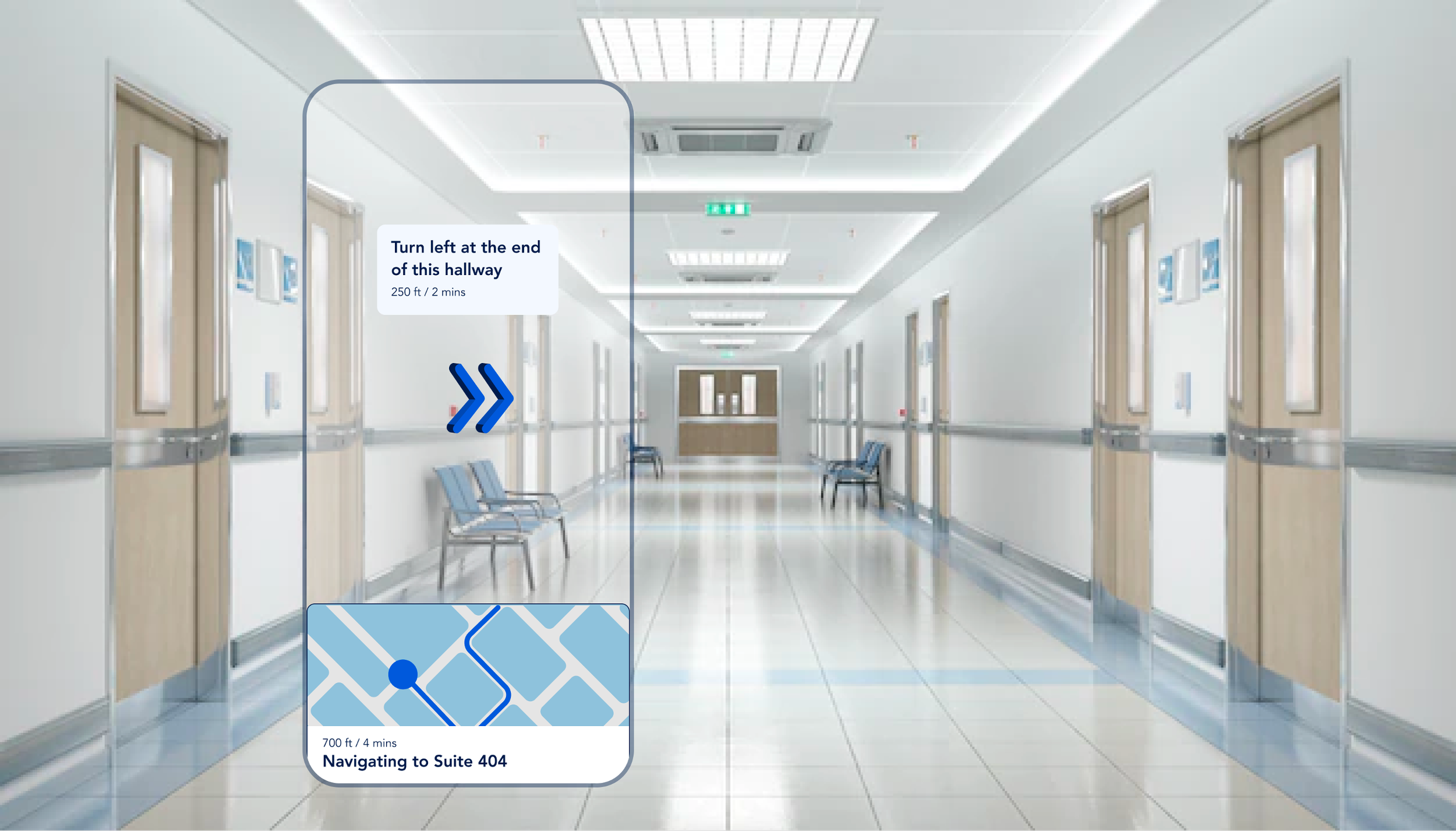
The making of Pinpoint
From the data I collected, I developed an experience map, which captured the user’s journey and emotional results at every decision point they encountered. I wanted to create a seamless onboarding experience for my target users to reduce their cognitive load and get them up and running on the app as soon as possible.
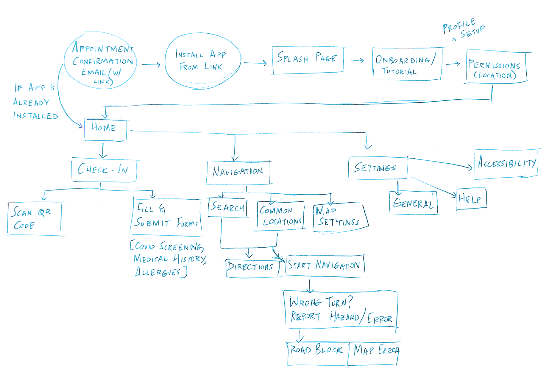
From here, I could decide what actions and features were essential and beneficial, and developed wireframes around these findings.
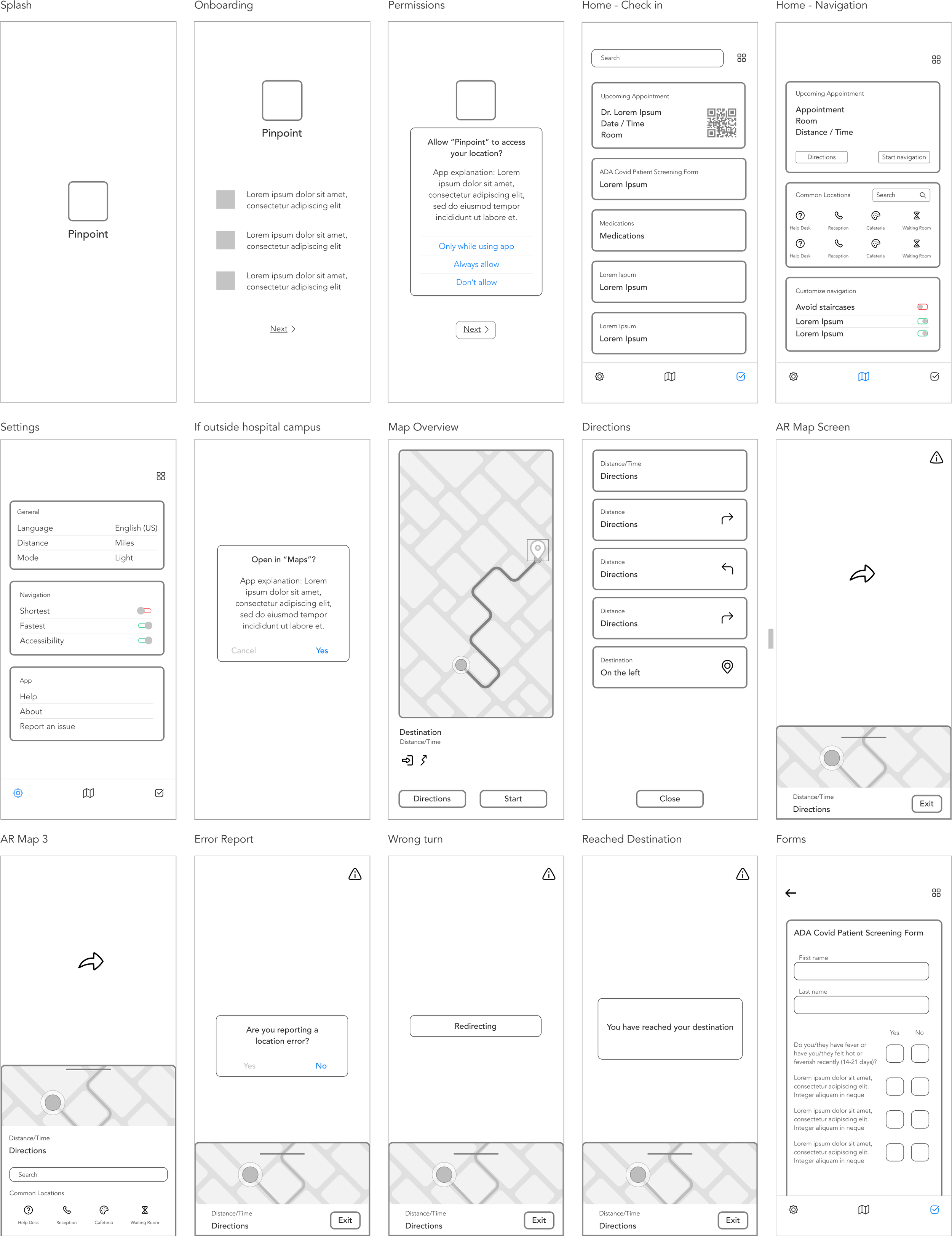
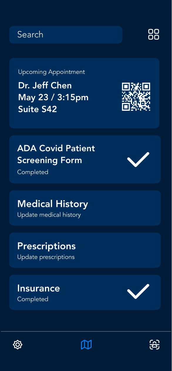
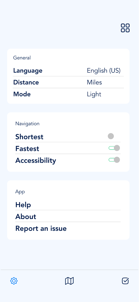
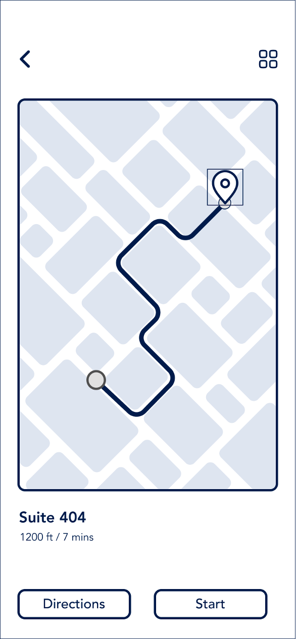
The app’s initial design involves a navigation of three choices: a check-in pane that lets users scan their QR code and fill requisite forms, a navigation pane that allows user to view and customize their routes and a settings pane.
While I had resolved the challenge of the app’s functionality, I also wanted to create a familiar interface that my target audience could use without a learning curve.

Taking into consideration the high stress state of potential users, I used cool tones to put people at ease and convey a sense of calmness. I kept my content and visual design simple to prevent users from getting distracted or overwhelmed by unnecessary information.
The Final Product
The app’s initial design involves a navigation of three choices: a check-in pane that lets users scan their QR code and fill requisite forms, a navigation pane that allows user to view and customize their routes and a settings pane.
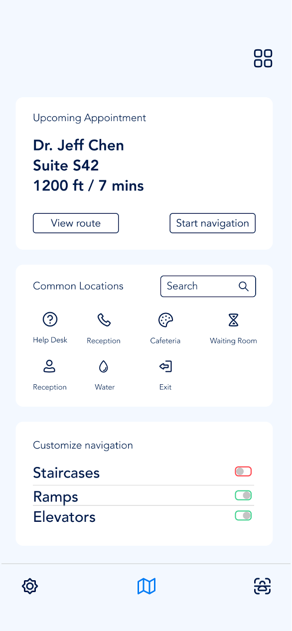
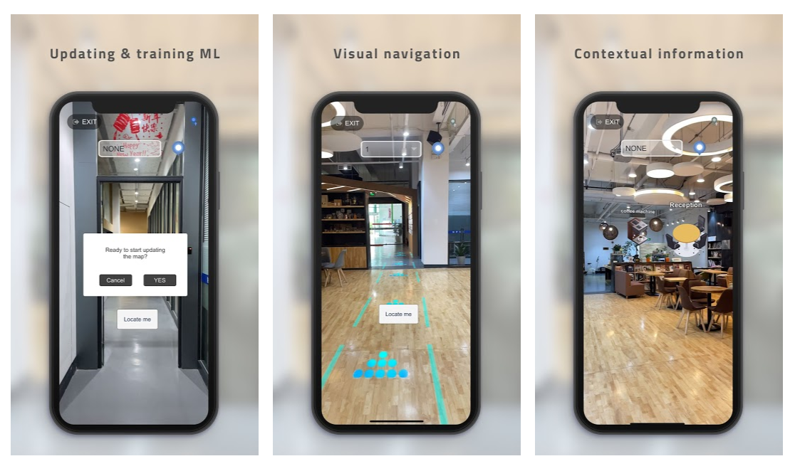
Leveraging vision and LiDAR data, Pinpoint presents a new navigation system based on recognizable landmarks. In contrast to traditional distance-based navigation, where it might be difficult to differentiate between similar distances, landmark-based navigation reduces position uncertainty and relies on a more natural navigational strategy.
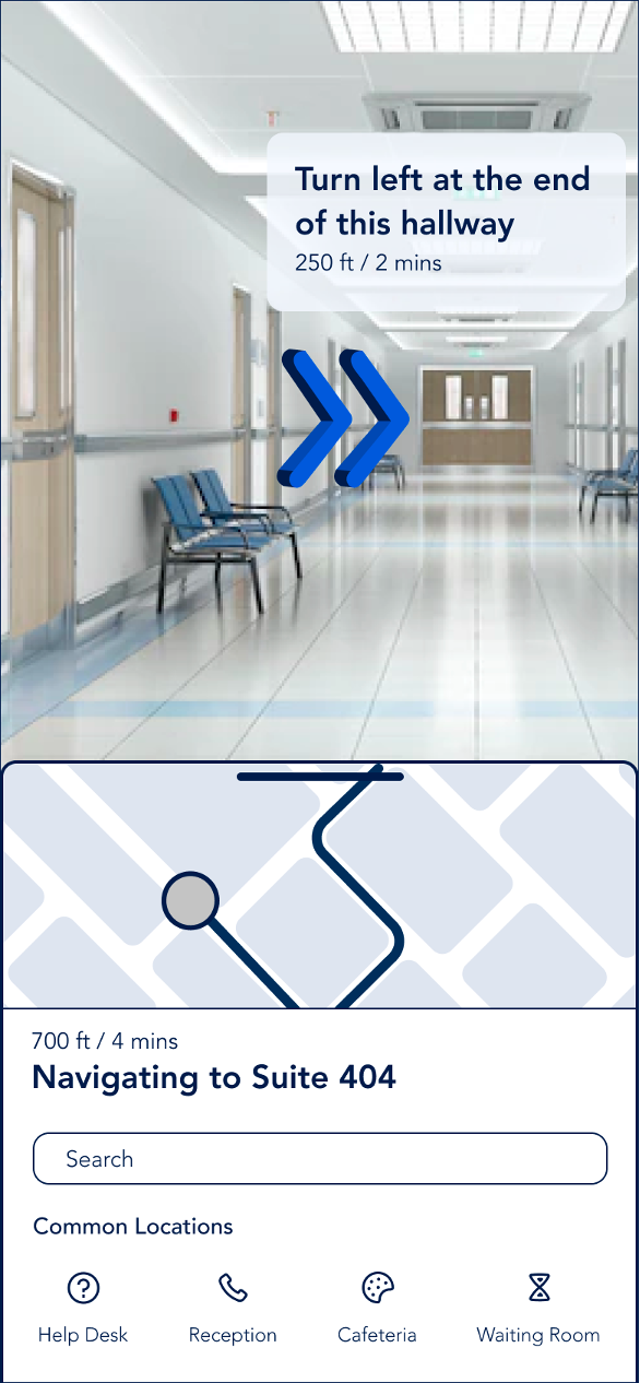
One of the pain points mentioned during stakeholder interviews was the visual overload caused by multiple signages competing for the user’s attention. I worked to ensure my app avoided clustering and reduced this overload.
Why should organizations consider adopting digital wayfinding?
Cost efficiency: Updating digital wayfinding systems is more cost effective than physical signage
User experience: Provides tailored instructions to users that go beyond the static “you are here” that maps provide, having an app also doesn’t compel users to hunt for another kiosk if they need more information
Going forward
There is still a lot to explore with Pinpoint. What if the app also retained the user’s information so they wouldn’t have to fill their information at the beginning of every appointment? What if the app also kept track of your annual check ups? What if it also helped you book appointments based on your schedule? These are just some of the questions I'd like to expand on as I continue to work on this project. Moving forward, I would also like to ensure the app is inclusive to include a wider audience.
Bibliography
Caduff, David, and Sabine Timpf. “The Landmark Spider: Representing Landmark Knowledge for Wayfinding Tasks.” Department of Geography, University of Zurich.
Epstein, Russell A, and Lindsay K Vass. “Neural Systems for Landmark-Based Wayfinding in Humans.” Philosophical Transactions of the Royal Society of London. Series B, Biological Sciences, The Royal Society, 23 Dec. 2013.
Landro, Laura. “A Cure for Hospital Design.” The Wall Street Journal, Dow Jones & Company, 4 Feb. 2014.
Mappedin. “Indoor Navigation in Hospitals: Improving the Patient Experience.” Mappedin.
“Improve Hospital Navigation and the Patient Experience with a Wayfinding Solution.” HealthWare Systems, 20 Feb. 2020.
“Wayfinding Strategy in 2020 - How to Make an Impact with Wayfinding.” REDYREF Kiosks, 19 Mar. 2020.
“Why Digital Wayfinding Signage Is Better for Your Business.” Broadsign.