Los Angeles Airport

RESEARCH, UI/UX
Partnering with Los Angeles World Airports or LAWA, the governing body of the Los Angeles Airport, Designit delivered a one-stop-shop portal for the Los Angeles Airport that supports its employees. We placed humanity at the center and focused all touchpoints on LAWA’s goal to deliver “utmost levels of safety, security and service for all.” The comprehensive digital and visual transformation struck a beautiful balance: It retained the existing brand equity while transforming the employee experience.
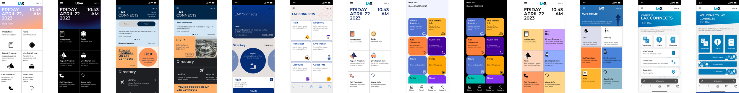
Designing a one-stop shop portal for Los Angeles Airport employees for a better work experience
I led and oversaw the UX process end-to-end for several features, partnering with product owners, engineers, researchers, content strategists, and client stakeholders. I organized and conducted user interviews. I worked very closely with product managers in identifying key features and gathering user requirements. I also constantly communicated with engineers on design specifications and accuracy of implementations to deliver a polished final product.
MY ROLE
PROBLEM DIAGNOSIS
We interviewed 17+ individuals who were actively involved in airport operations. We learnt about stakeholders’ roles and relation to our program and discussed employee pain-points and needs.
Interviewing stakeholders
PERSONA MAPPING
From our research, we could further segment our main users into three groups: airport leader, civic worker and active servicer. We also broke down the users by their attributes, pain points, motivations, goals and responsibilities.
Building user personas
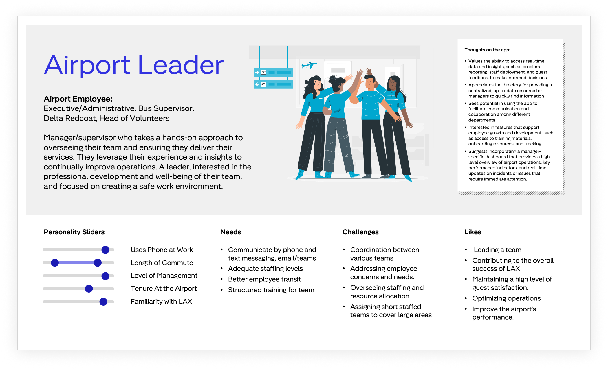
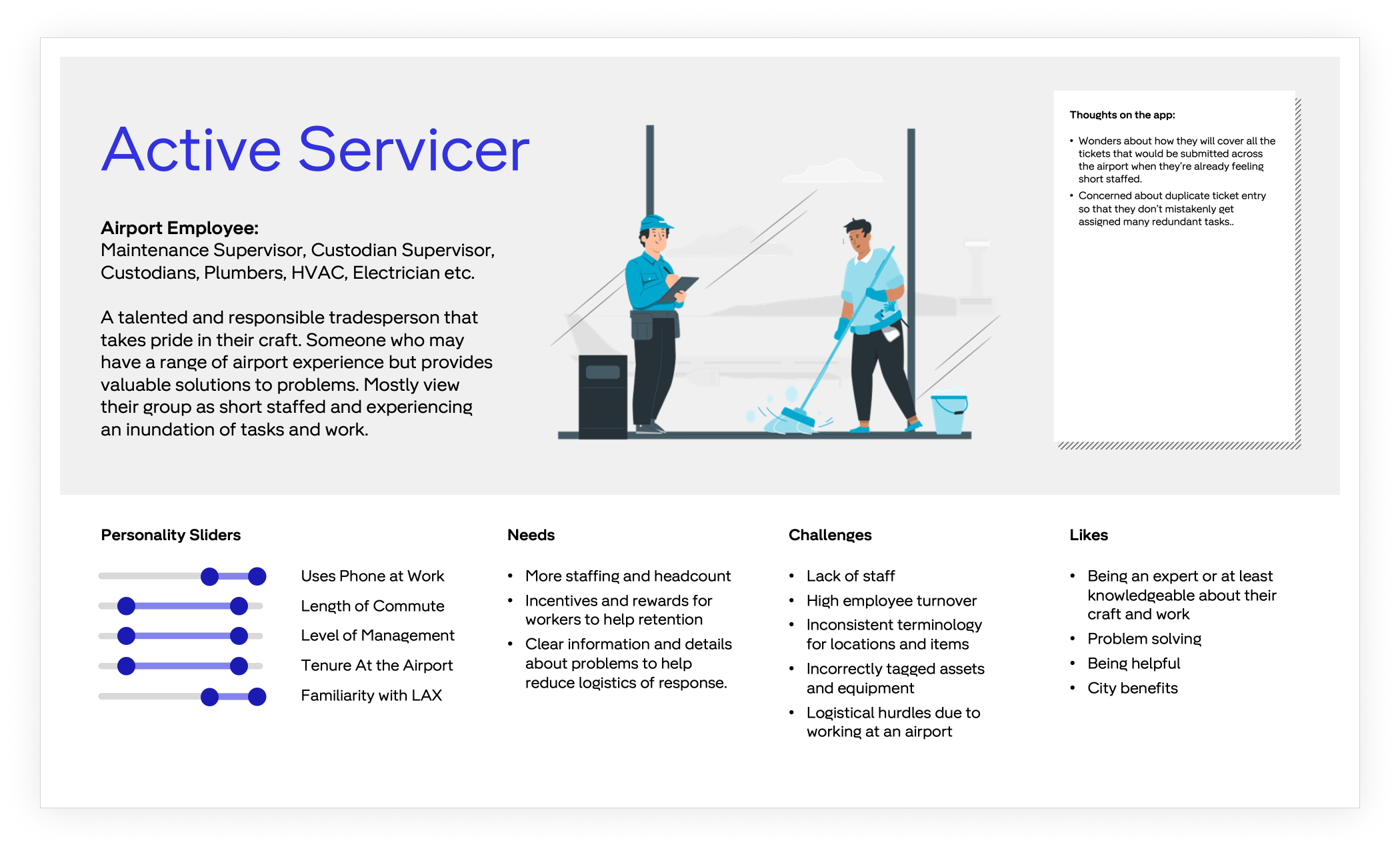
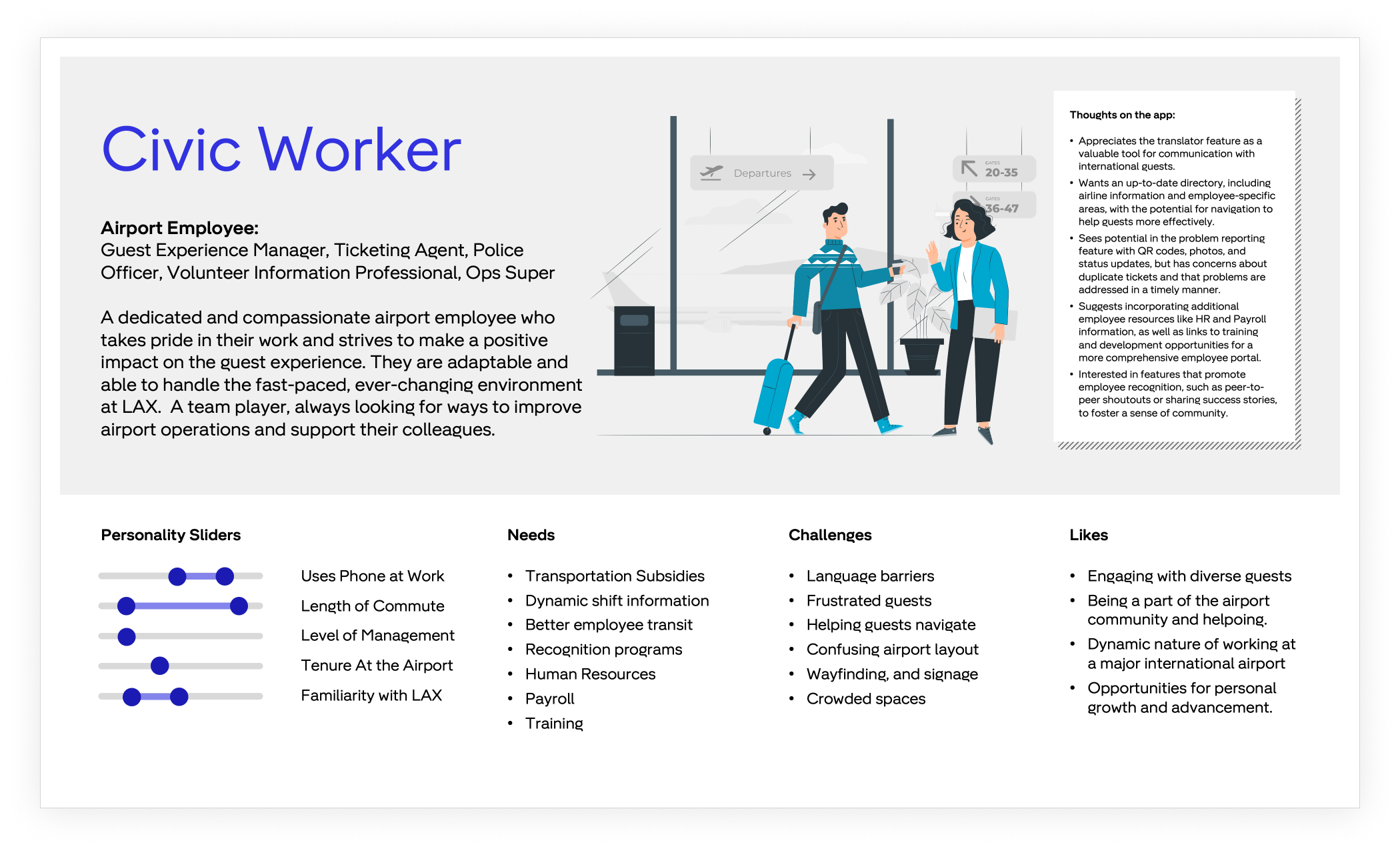
Persona mapping helped us establish a user journey and gauge user needs and pain points, which included:

Employees need timely information as emergencies and large scale changes occur at LAX frequently.
Communication
Employees need to plan for additional time in their commutes as the employee parking lots are far from their job sites.
Transit

Employees benefit from efficient and affordable food options and help increase revenue for food concessions.
Dining
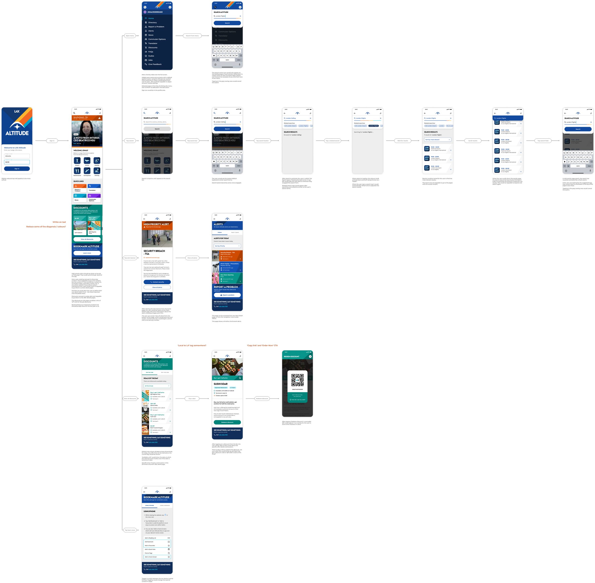
USABILITY TESTING
Wireframes, but more!
We tested a total of 4 concepts to guide conversation on multiple topics and the needs of employees.
Landing page
We tested 3 versions of the landing page to understand the types of content and level of detail that employees prefer.
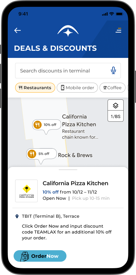
Deals and discounts
We tested 2 versions of the marketplace to test both the viability of Discounts as a prominent feature as well as the desirability
of an interactive map.
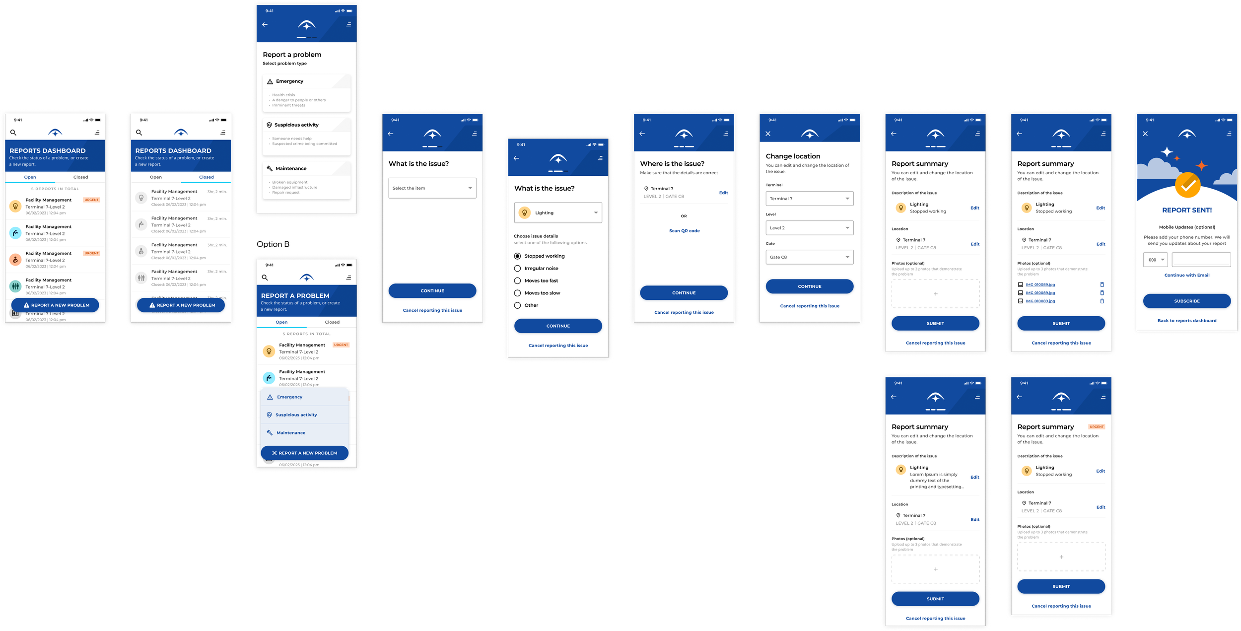
Problem reporting
A new flow for report a problem was tested with participants to validate the current needs when reporting urgent issues.
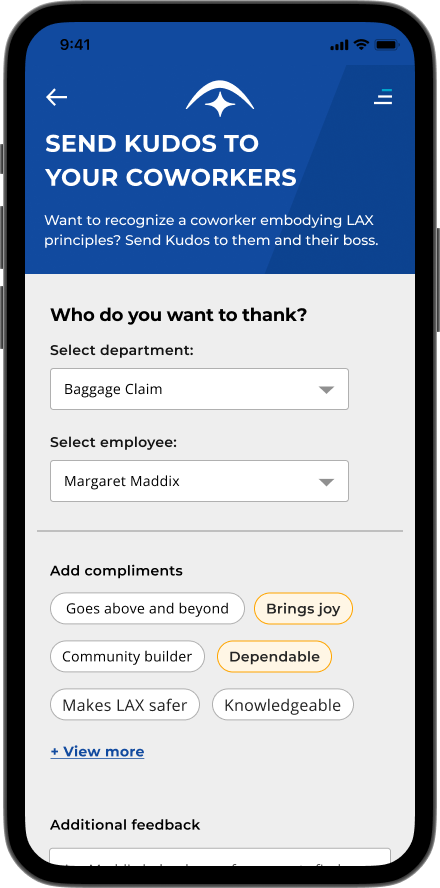
Kudos
The concept of Kudos was tested with employees to understand the desirability for employee recognition to build more community across LAX.
We found that wireframes didn’t draw the best feedback from our stakeholders, but on the other hand, overly polished screens didn’t provide consistent feedback either. Our solution was to provide fleshed out screens with the right copy and enough contextual design.
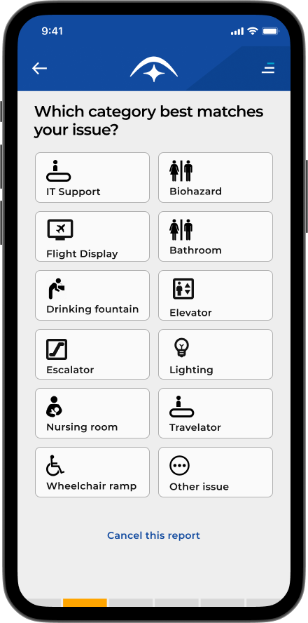
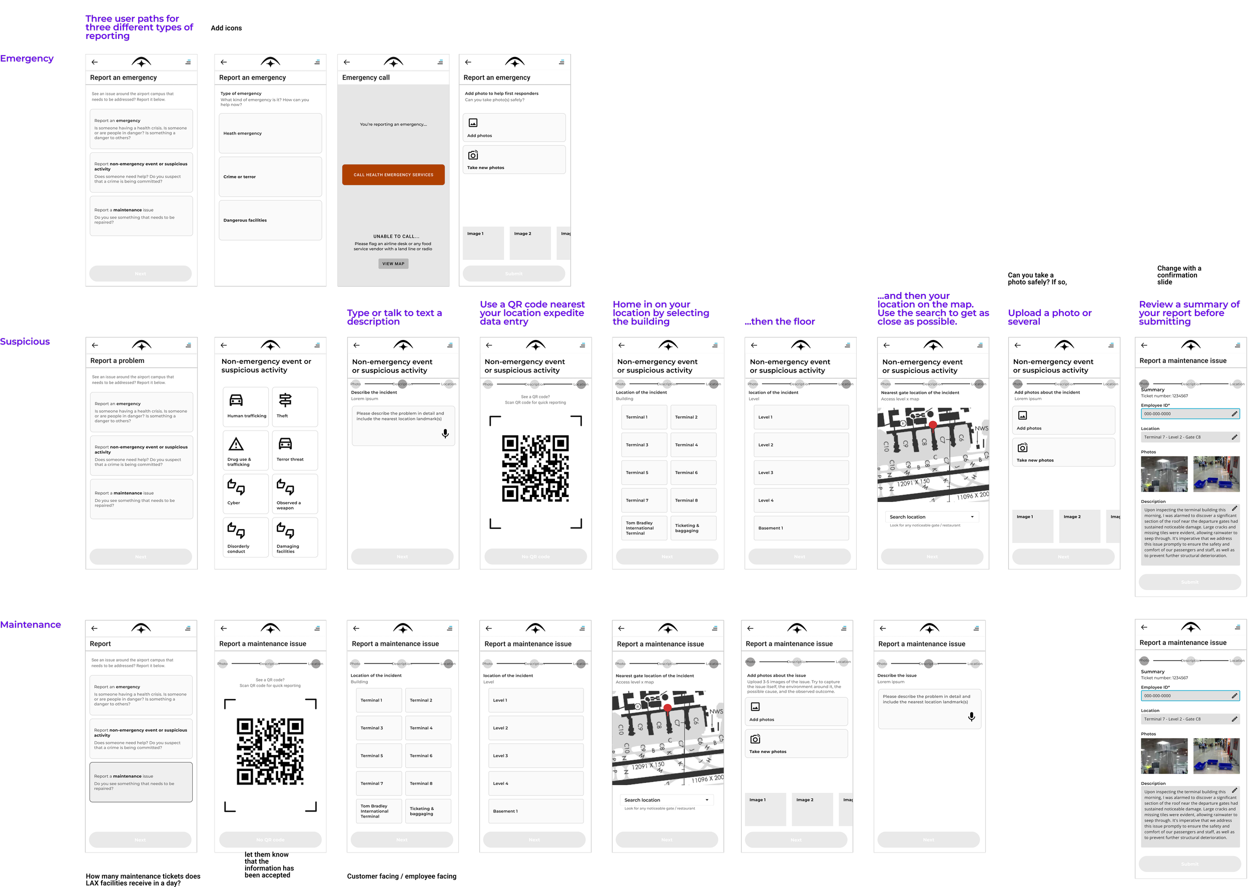
REPORTING ISSUES
Reporting unexpected issues overwhelmed airport employees, so we streamlined the process by prepopulating forms, giving them the ability to offramp to phone numbers and separating flows for emergency and maintenance issues.
A streamlined problem reporting pathway
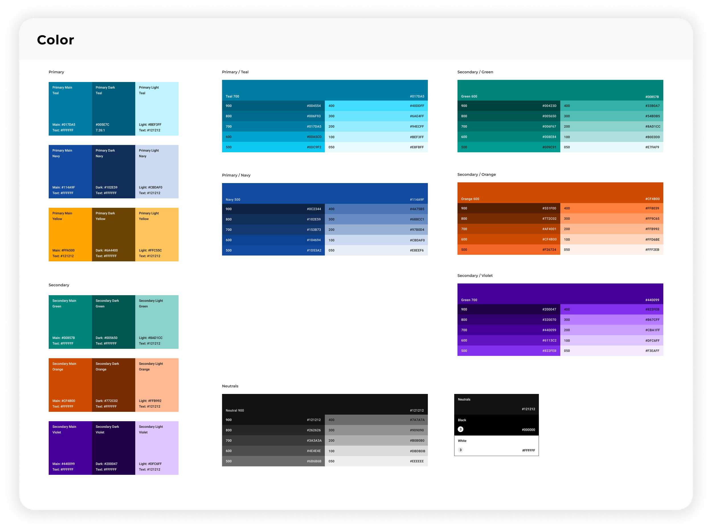
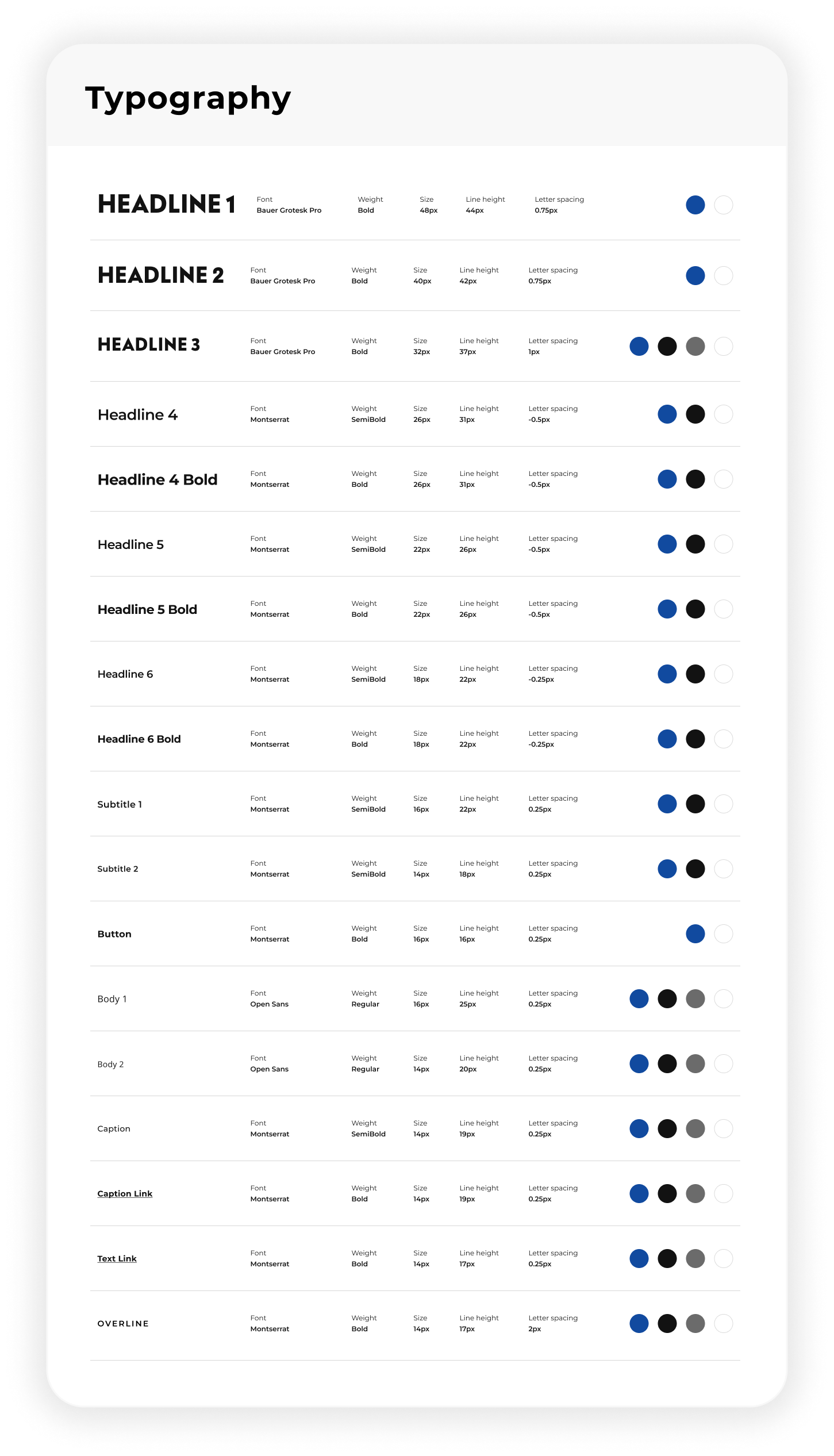
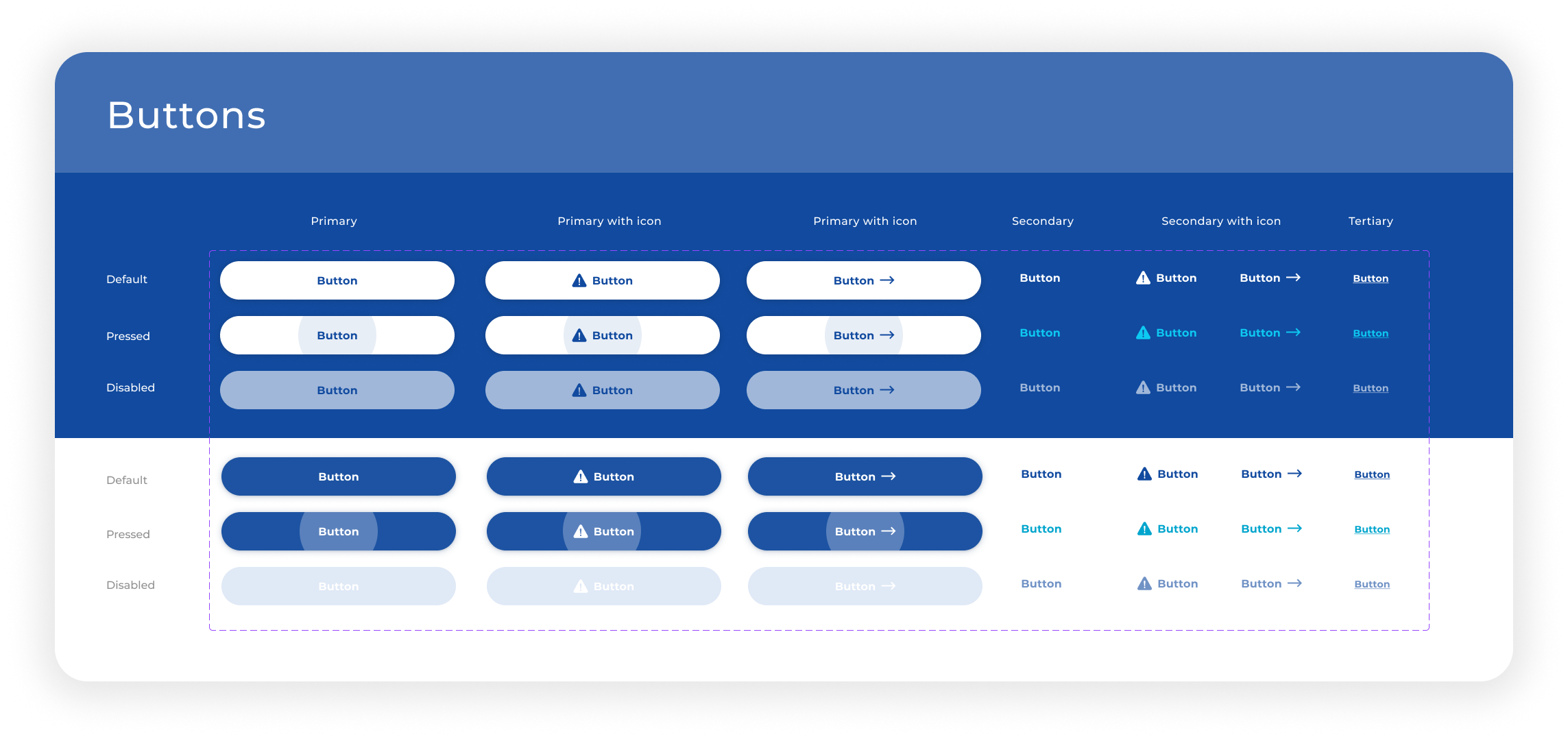
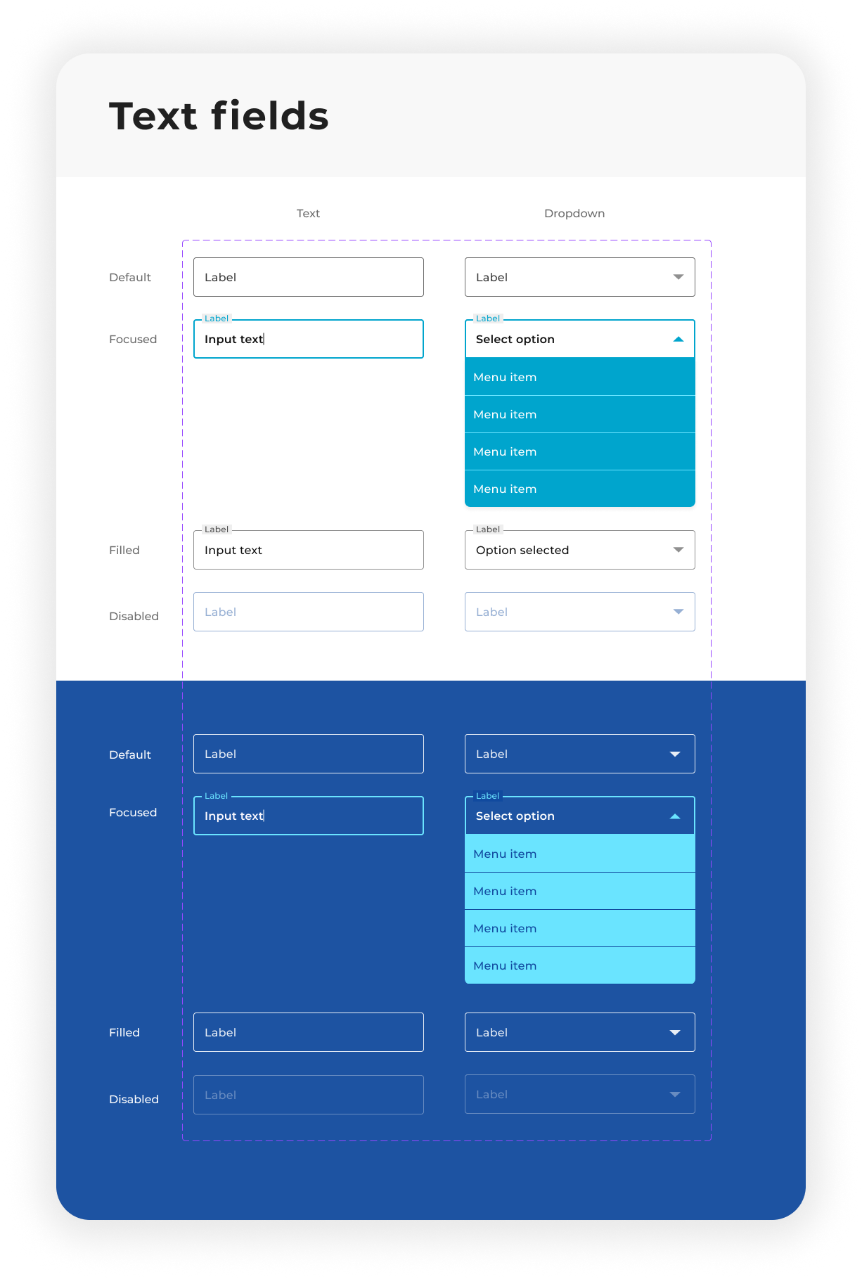
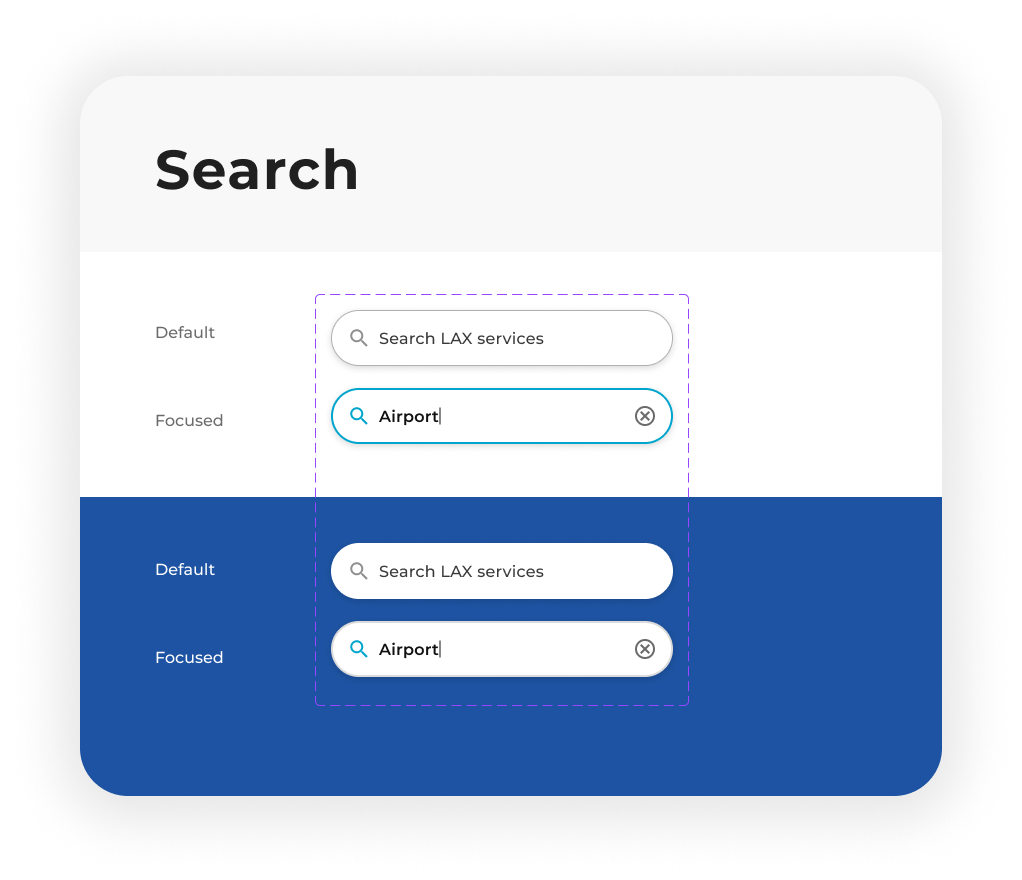
DESIGN SYSTEM
We took an atomic design approach, breaking down our design system into atoms, molecules, and organisms that could be built upon each other. Our aim was to create a system that would be both efficient for designers to use and easy for developers to implement.
Building a system that scales
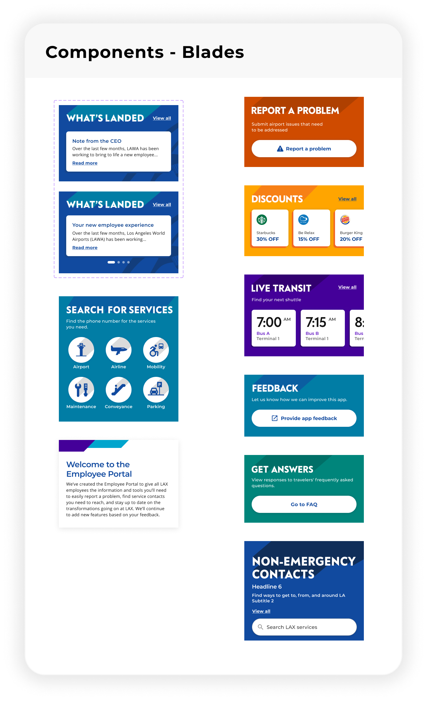
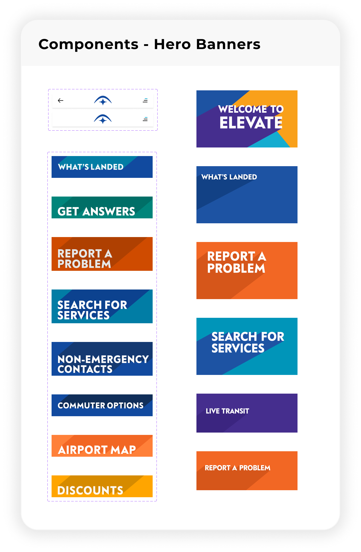
INTERFACE DESIGN
LAX faced the challenge of having disparate visual styles catering to different aspects of their business. Our task was to seamlessly blend LAX's consumer-facing campaigns while ensuring that the app retained its unique brand identity.
Establishing an identity
Our strategy revolved around crafting a navigation system that intuitively guided users between the two experiences while incorporating subtle visual cues and brand elements to reinforce the connection between them. We also implemented carefully selected components to complement the unique conceptual tone of each feature, resulting in a cohesive and unified digital experience
SOLUTION
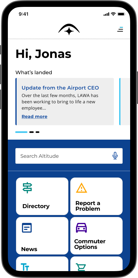
Altitude takes flight
The employee portal, titled Altitude took off towards employees with features aimed at saving them time and focused on improving their access to valuable daily information.
REPORTING ISSUES
Reporting unexpected issues overwhelmed airport employees, so we streamlined the process by prepopulating forms, giving them the ability to offramp to phone numbers and separating flows for emergency and maintenance issues.
A streamlined problem reporting pathway
TO CONCLUDE
The impact
With 55,000+ employees on campus, LAX had issues relaying airport information to all. We bridged that gap by creating Altitude, a place where important airport details or announcements can be easily accessed by all employees.
The current version is a strong foundation for LAX to allow for us to layer extra features such as AR-based navigation and Translation support for next potential iterations.