Client: Credit Karma
Agency: Designit
Roles: Design Research, UI/UX Design, Interaction Design
Credit Karma’s brand promise is to empower members with the knowledge and technology to achieve their own individual progress. In the spirit of this commitment, we create a motion design guide that aligns with the ideal of technology making the experience easier for members and providing them confidence in their ability to move forward.
How might we enhance the Credit Karma application through motion?
To enhance the user experience of the Credit Karma app, we listed out the following project goals:
Goal 1: Craft additive motion guidance to the brand design system that align with the intended purpose of the Credit Karma experience.
Goal 2: Provide contextual guidance to employ animated elements for a more seamless Credit Karma application user experience
Goal 3: Establish a simple, straightforward motion design system that facilitates clarity – not only for the end user, but also for the internal Credit Karma team member(s) who will execute on the guidance.
Goal 4: Establish clear structural and mechanical implementation direction to support the Credit Karma story, as communicated through motion.

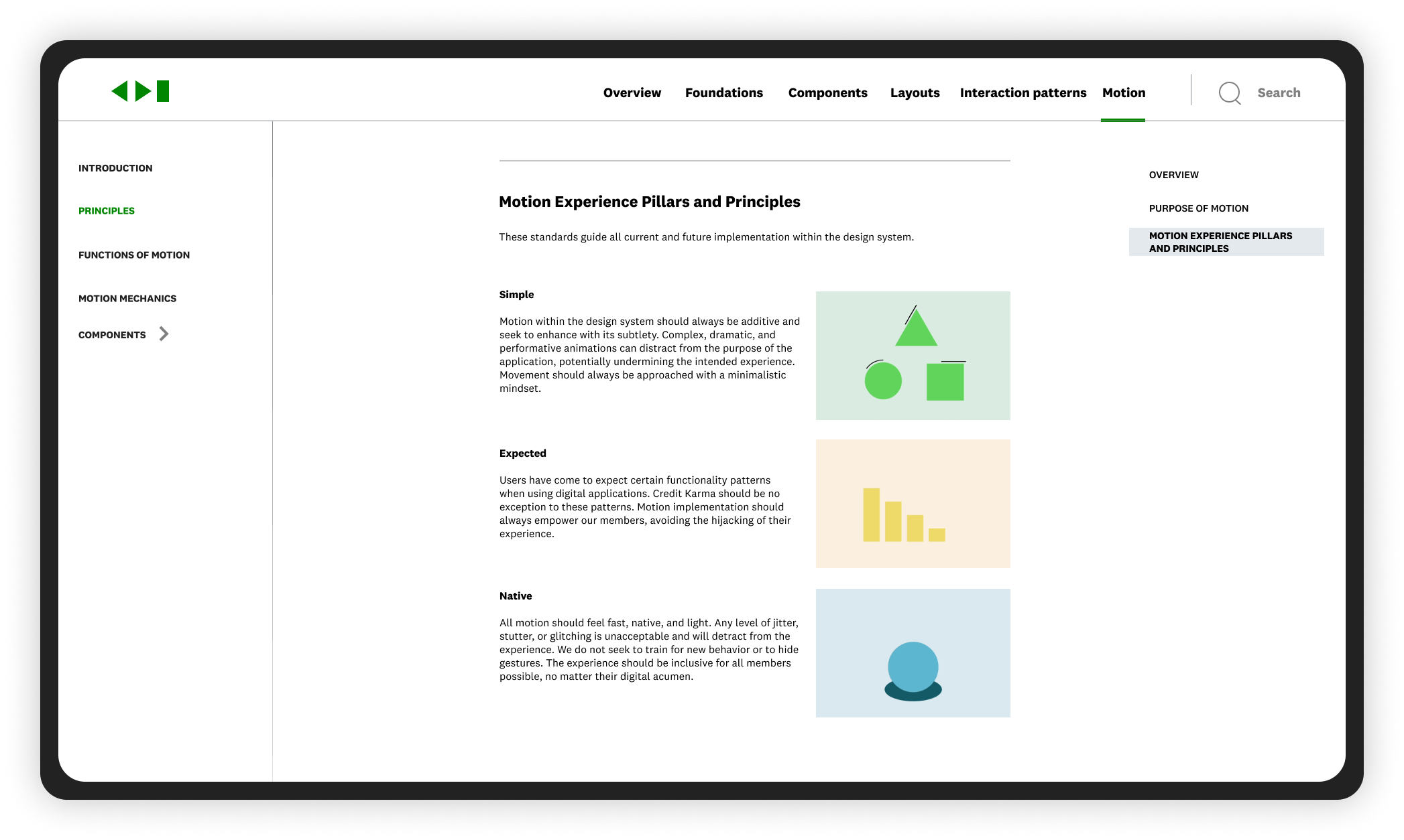
Defining principles
Our first step was to explore and outline the role of motion in user experience with a focus on best practices and use cases.
Start with principles
Broad to specific. Big to small. Answer the why. Be descriptive instead of prescriptive. Provide a framework of understanding so designers can find their own solution that aligns to the design system. Brevity is great but opt towards too much vs too little.

Define patterns
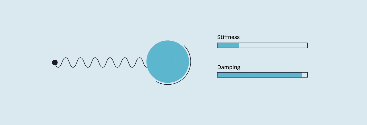
Keep It Simple, Stupid. For X situation, do Y. Define a set of standard elements of motion for common situations. These can be broad, like what ease to use for animating elements in on a blank page, or specific, like how long it should take for a button to change state when pressed.

Show it in action
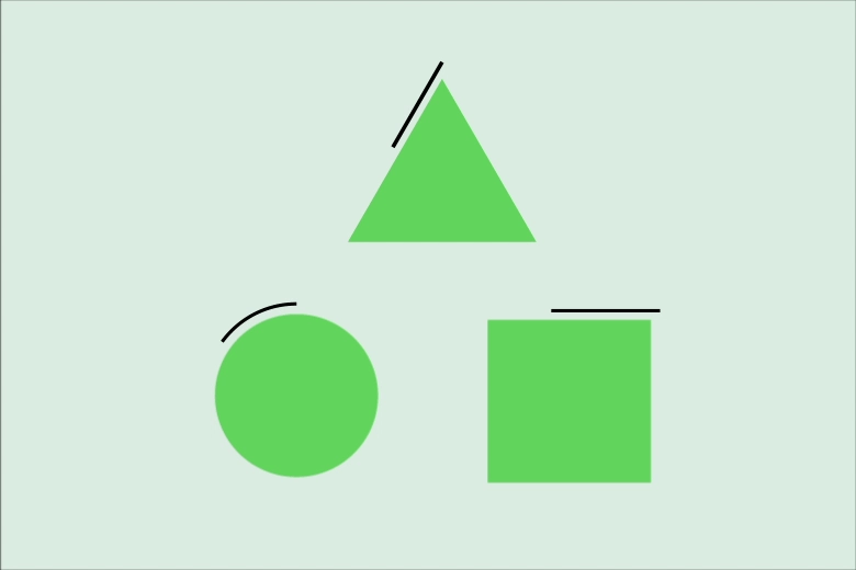
Use ample visual examples, and make sure those examples represent real-world scenarios the reader is likely to encounter. Words are great, but we need to see it to have the same mental mapping from concept to execution. These usually take the form of short, simple animations that can be embedded next to descriptive copy.
Auditing the app and other systems
We conducted an audit of the app and surfaced potential opportunities to inject motion into the experience. And then we assessed successful motion design systems to extract best practices surrounding structure and altitude.
Stakeholder evaluations and findings
We engaged in an image voting workshop to align on what kind of brand experience our motion elements should reflect. It was further synthesized into experience attributes that informed the development of the motion system.
Our new motion system should not feel:
Inconsistent
Editorial
Annoying
Slow
Inhibiting
Our new motion system should feel:
Unobtrusive
Simple
Functional
Responsive
Competitor audit
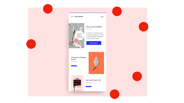
The team assessed competitors such as Acorn, Credit Sesame, Nerd Wallet and Mint to examine and appraise their use of motion specifically in the realm of application design.
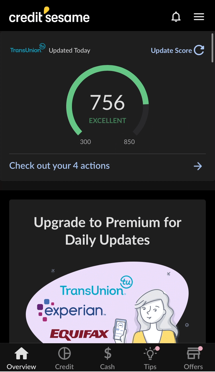
Credit Sesame
Implements some of the more interesting swiping animations and transitions when navigating menus
One of the few competitors that animated some of the data visualizations in app
Broad animations such as loading screens, button presses and pull-to-refresh animations are generic and do not reflect any branding
Mint
Interesting implementation of a timed delay between elements appearing on screen in some menus
Some animations on graphs and charts based on customer data

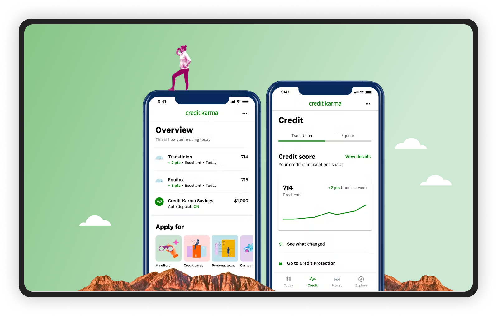
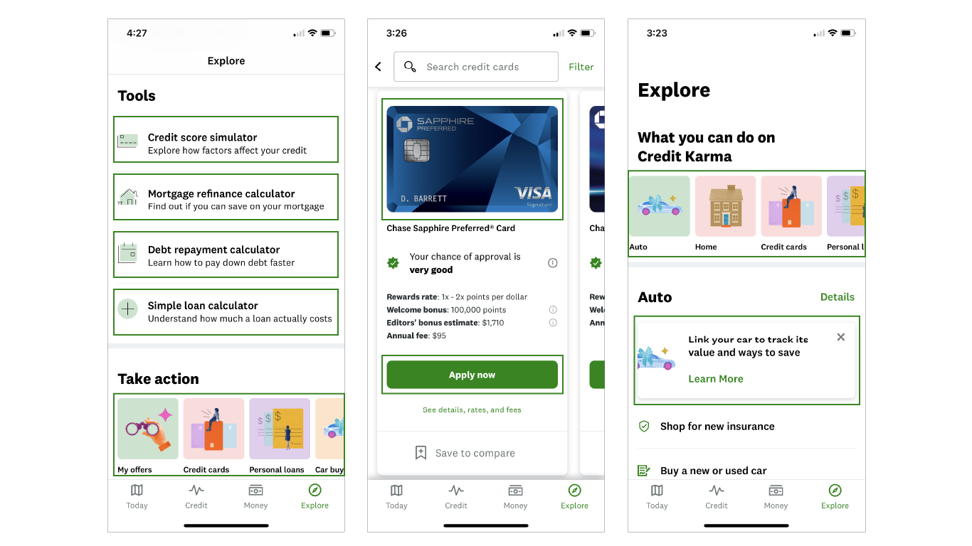
The motion design guide
The guide establishes clear structural and mechanical implementation direction to support the Credit Karma story and provides contextual guidance to employ animated elements for a more seamless Credit Karma application user experience.
View full motion guide here.
Rather than using animations for surface-level delight, we leveraged motion for usability: to provide context about what is happening with the system, to signify the behavior of UI elements and resolve common issues such as change blindness.
In conclusion
The motion guide was well received by our clients. We helped build a foundation that Credit Karma’s internal design team could refer to in the future to standardize components within their system.