Apple

INFORMATION ARCHITECTURE, UI/UX
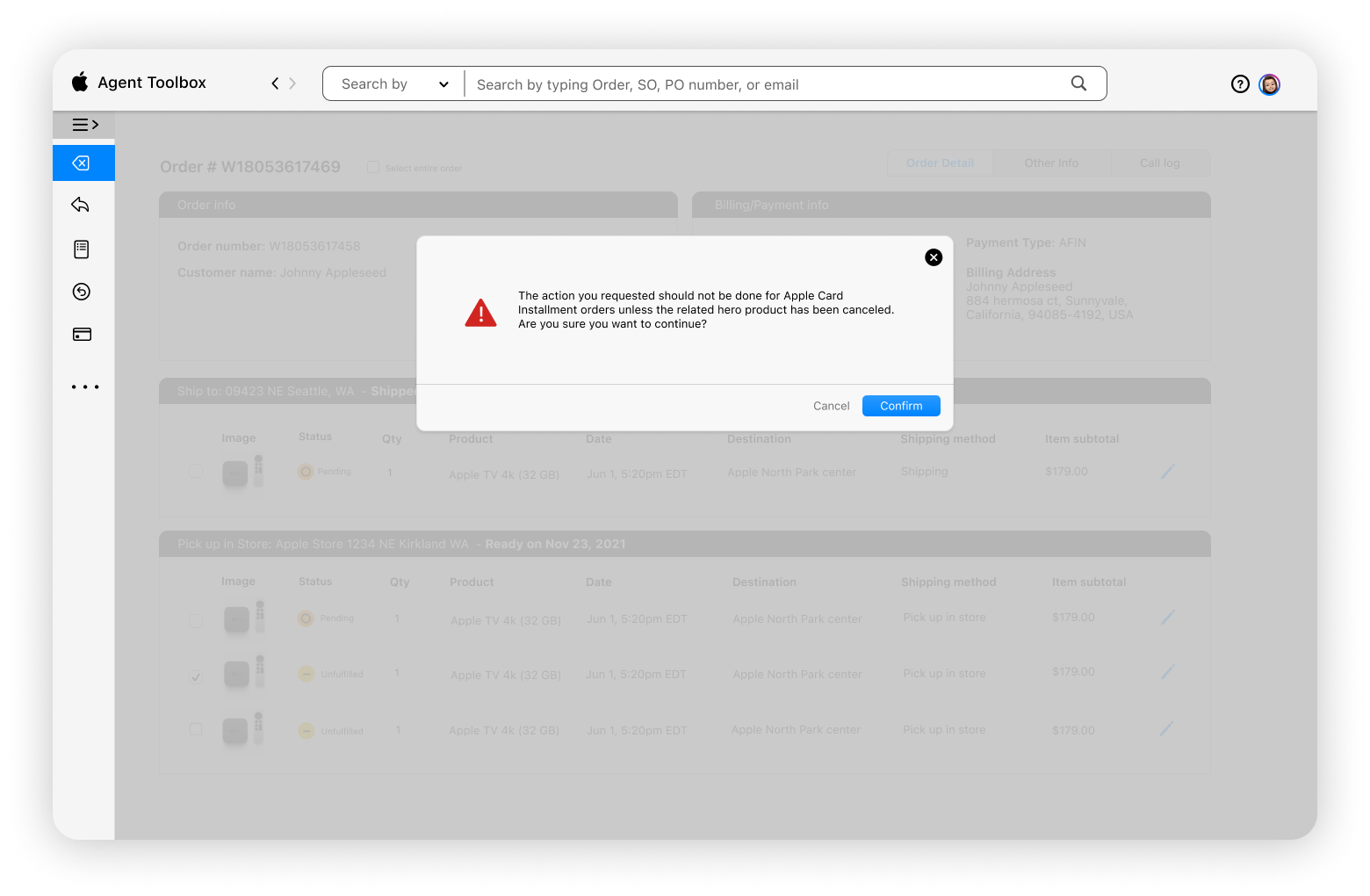
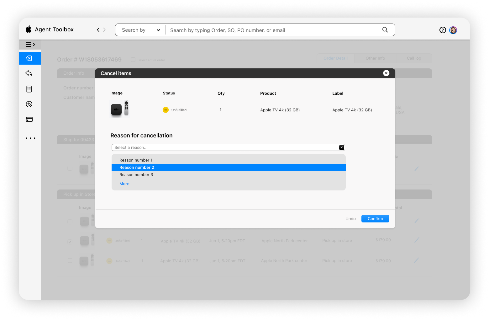
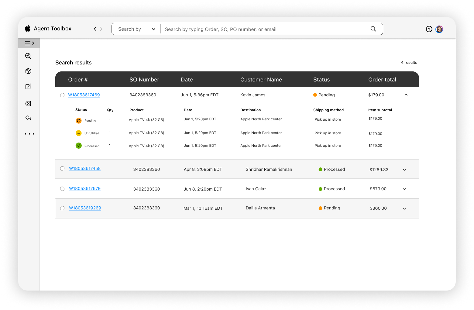
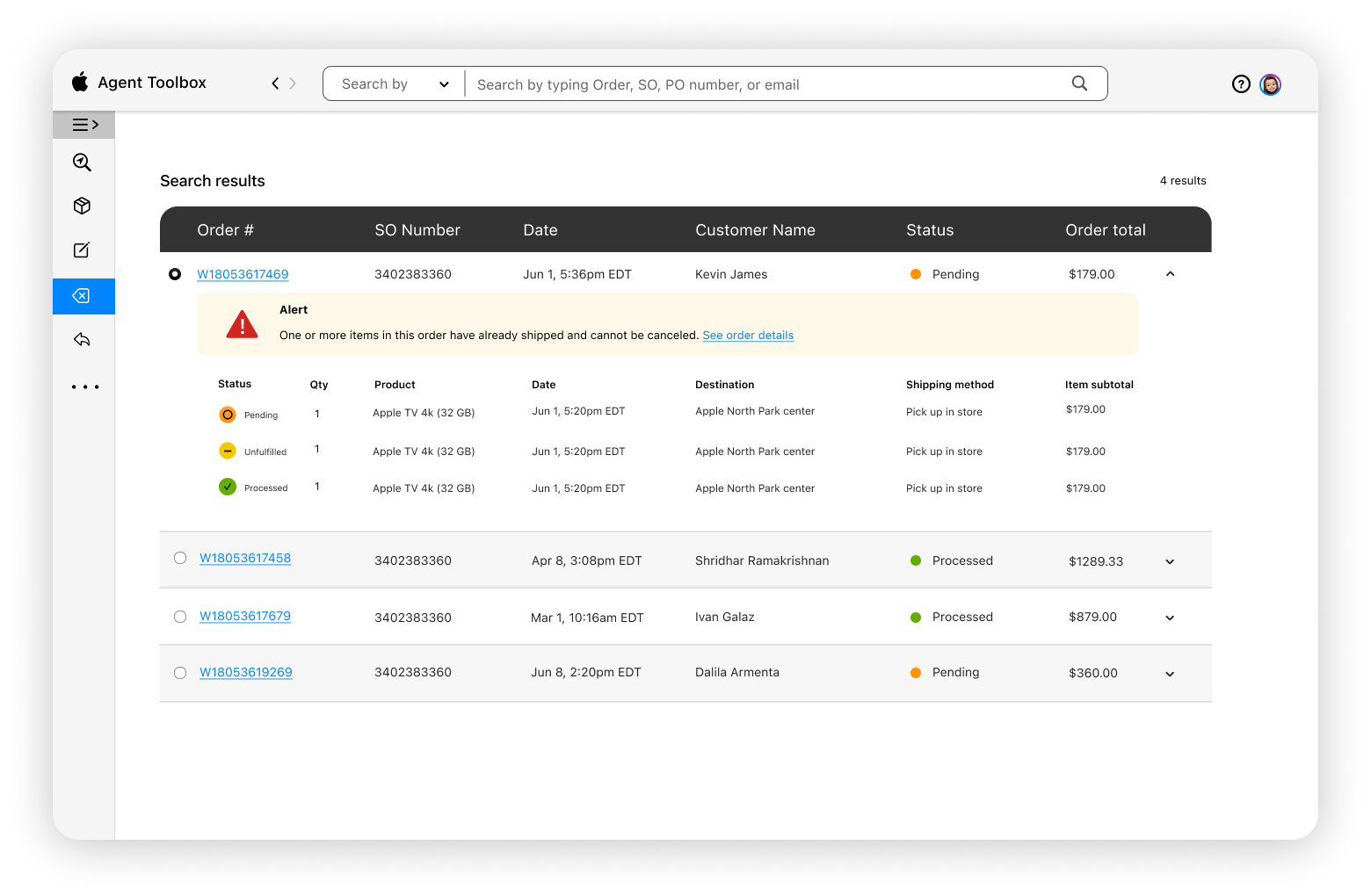
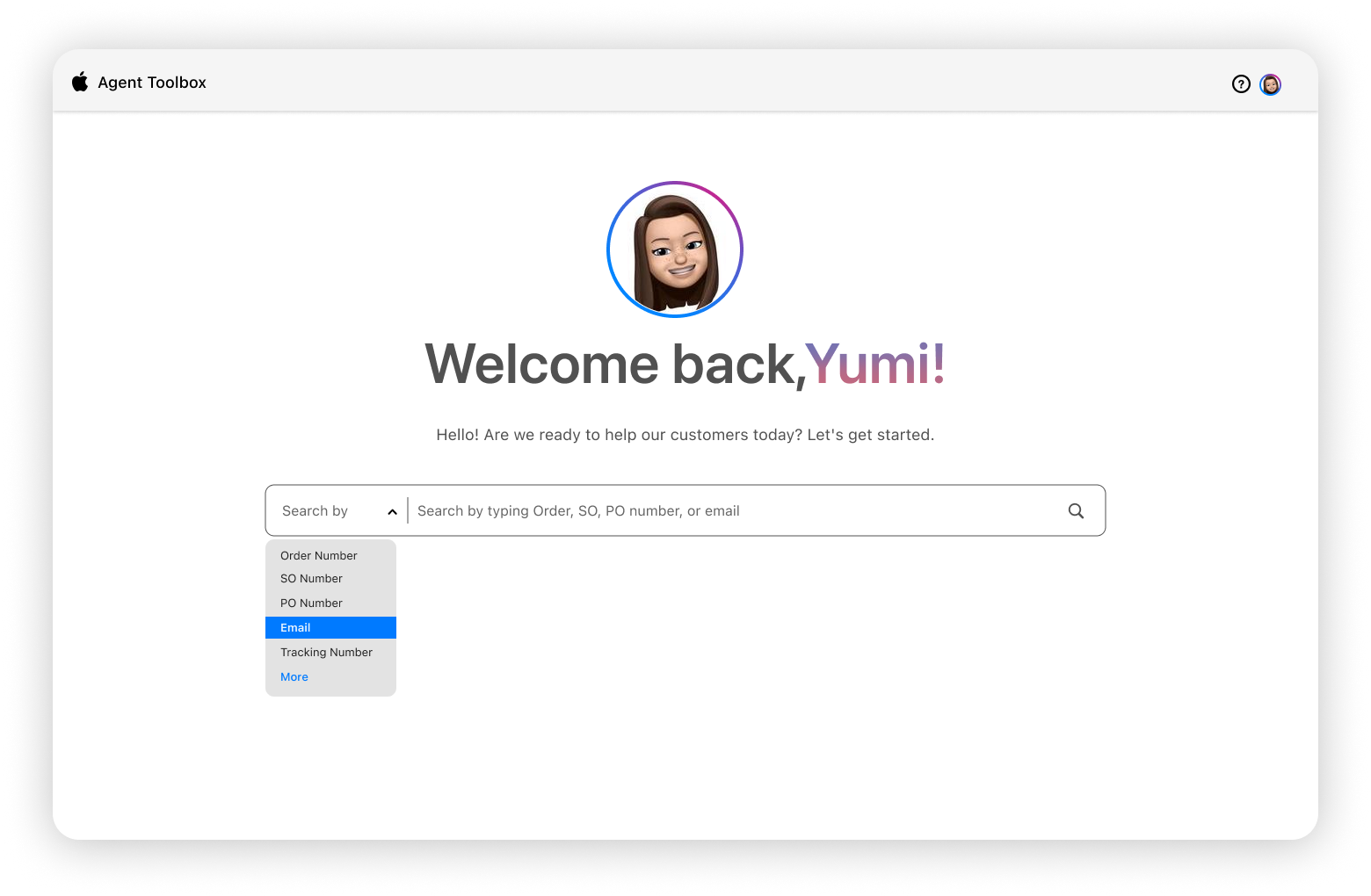
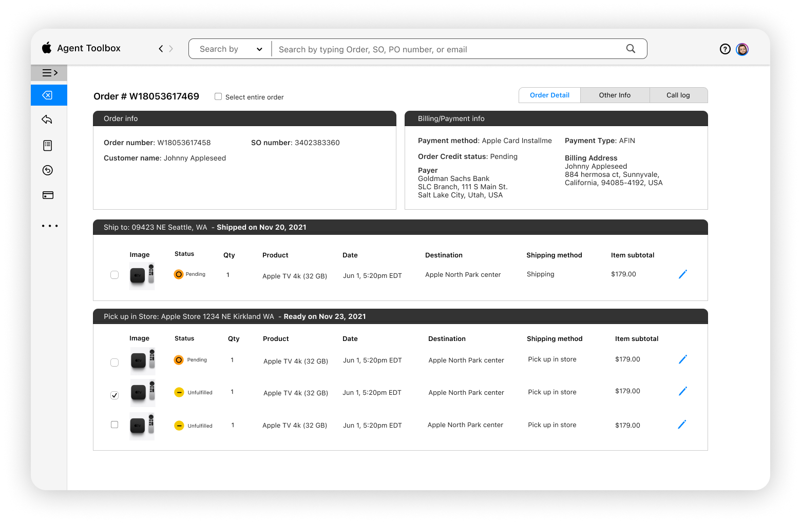
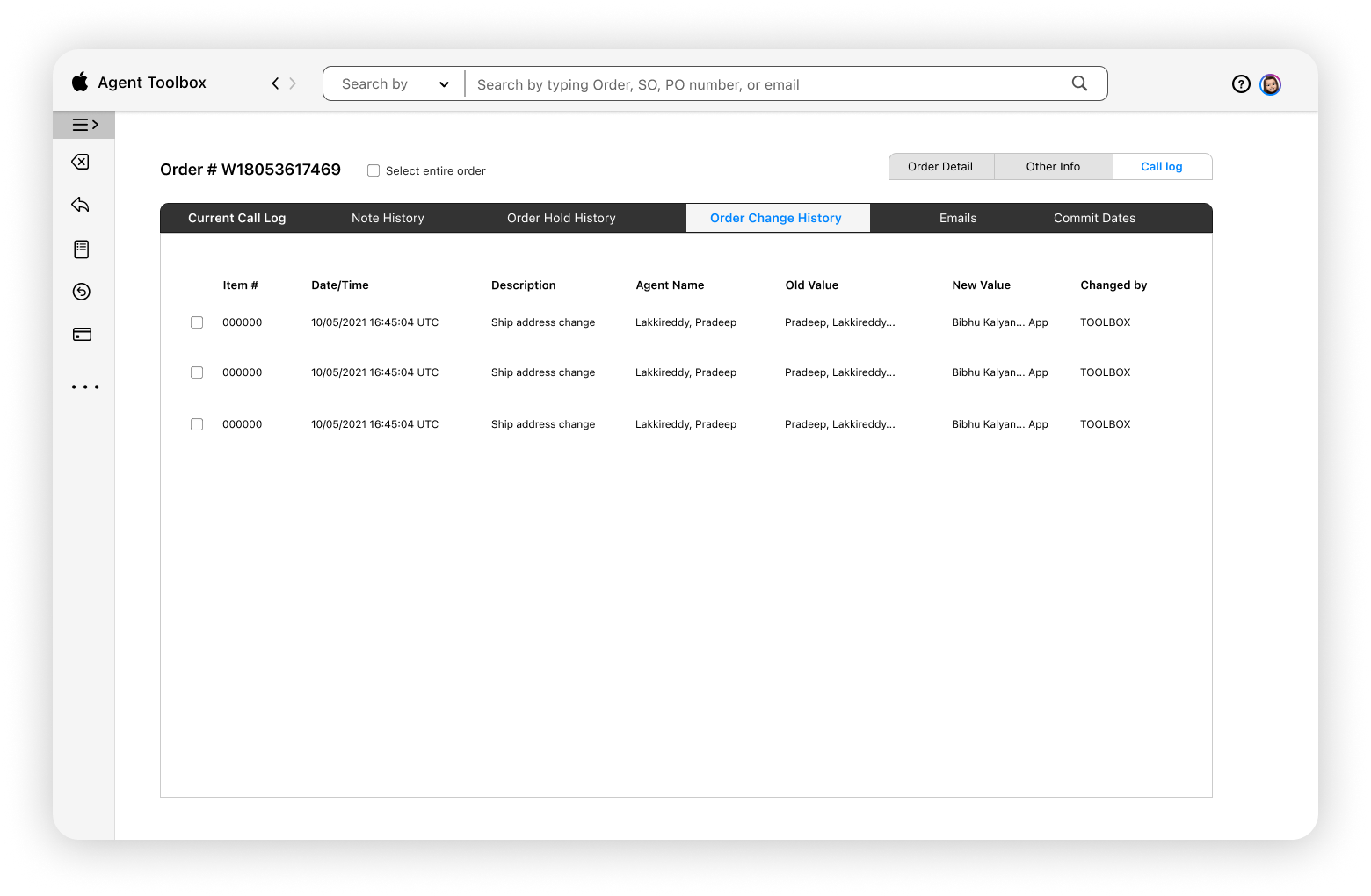
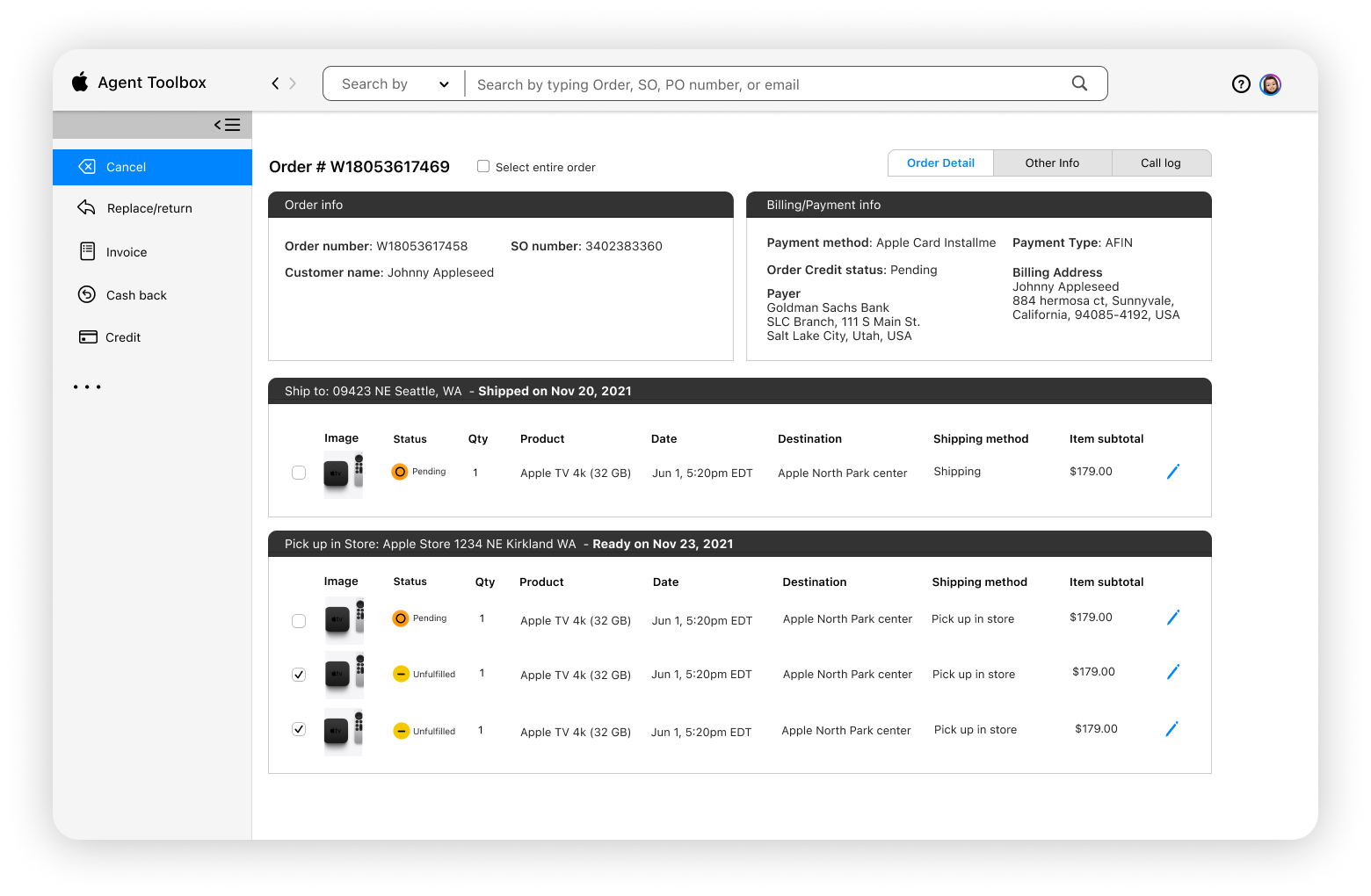
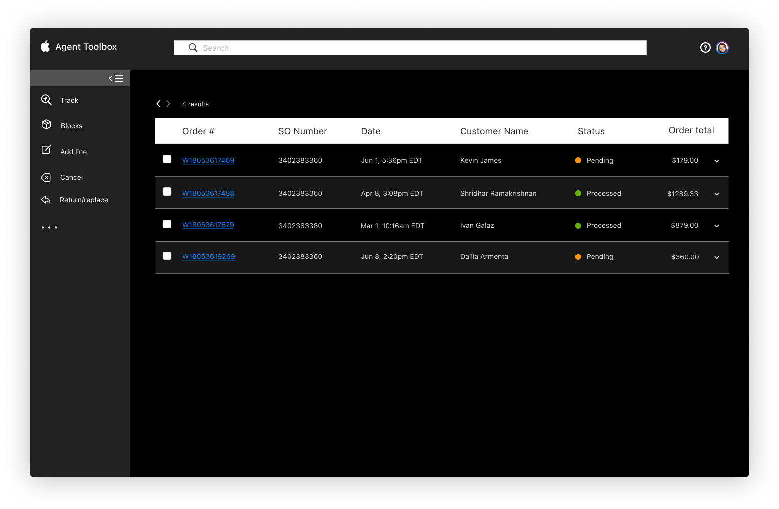
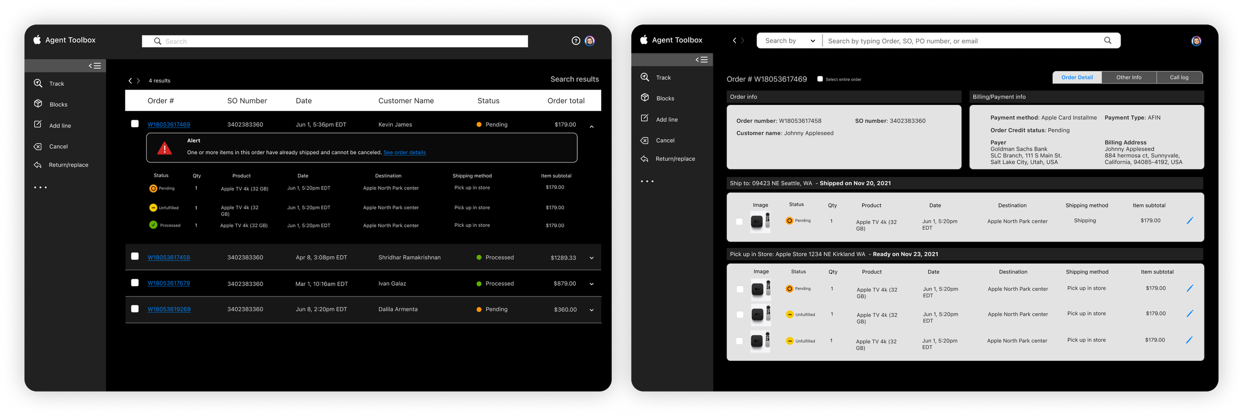
Partnering with Apple and Wipro, we redesigned Apple’s internal application to manage inventory and process orders and returns. This project showcases the relaunch of Apple’s ATB toolbox with a more intuitive experience. Given Apple’s strong brand identity, we soaked in the design language and propelled it forward with a component-driven design to create this application.
Ensuring an optimal user experience without a steep learning curve
PROBLEM DIAGNOSIS
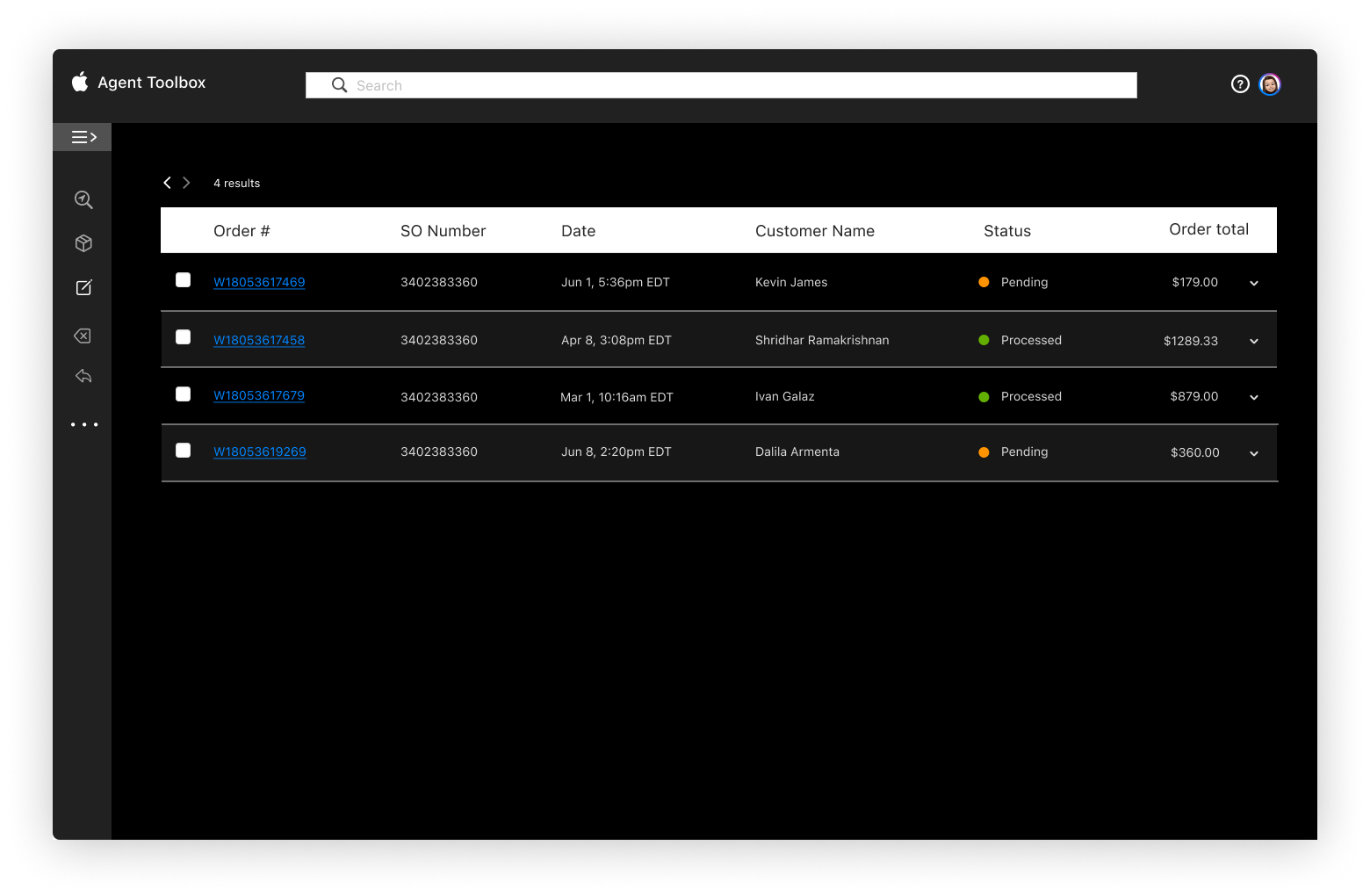
Through various stakeholder workshops, we were quickly able to identify that the experience was less than intuitive, with users finding it difficult to navigate to find information. As this was an internal software, it hadn’t been updated recently and with added functionality, was proving to be quite a challenge for users.
Starting with the user
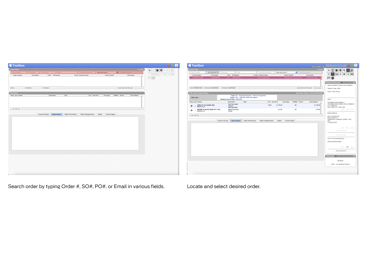
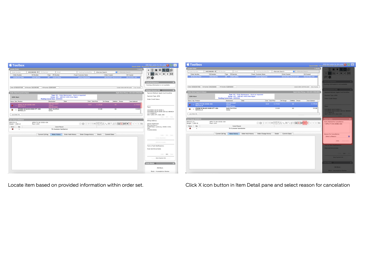
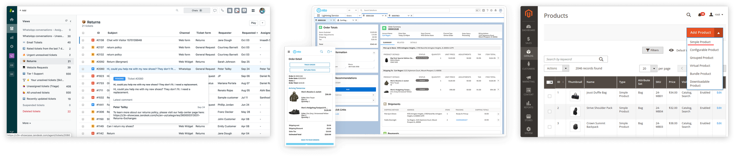
We reviewed interfaces from competitors such as Zendesk, Shopify, Magento, Salesforce, BigCommerce and also Apple’s customer facing order manager to determine common successes and failures within each to inform our conversation with stakeholders.
Competitors
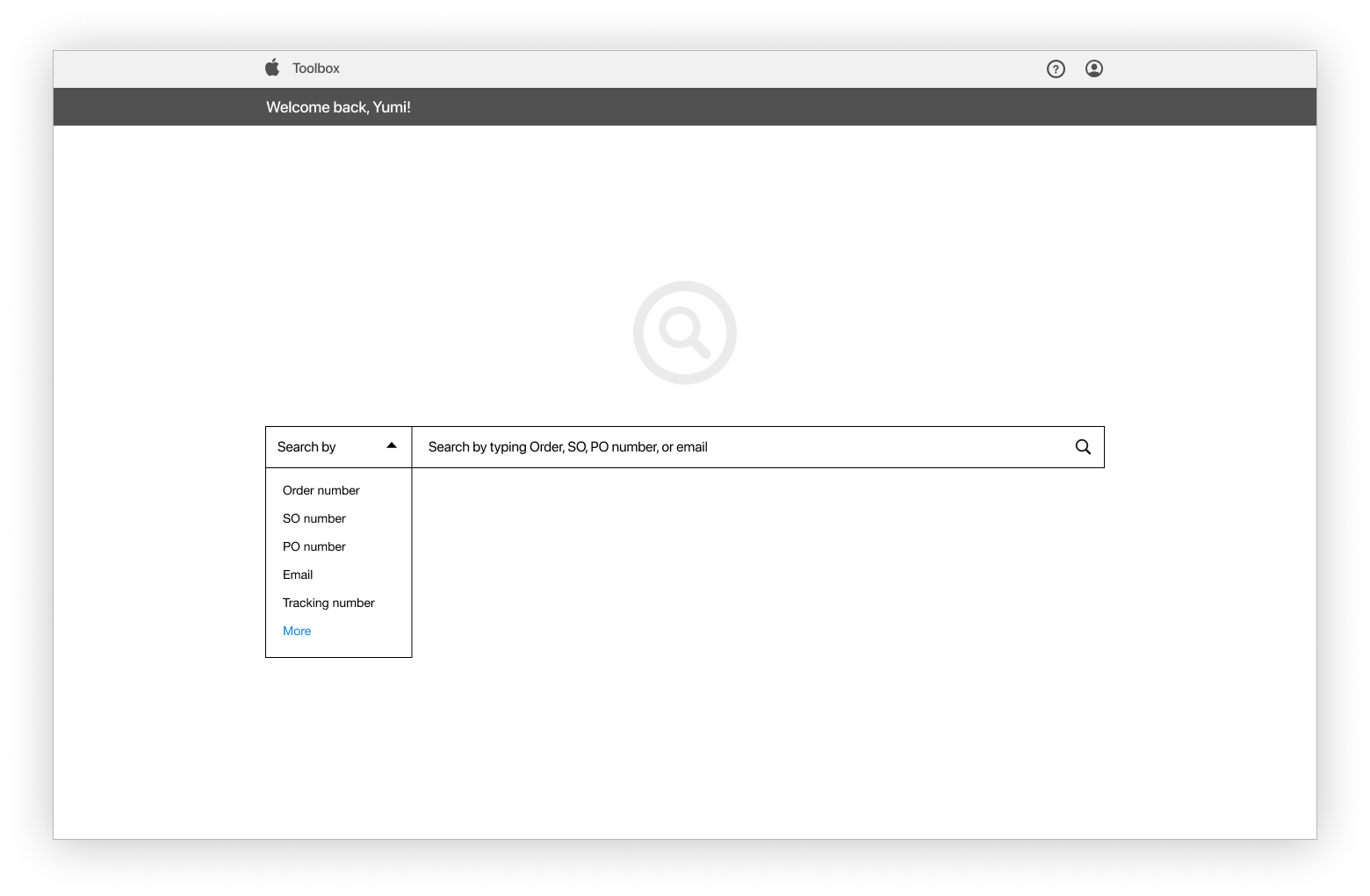
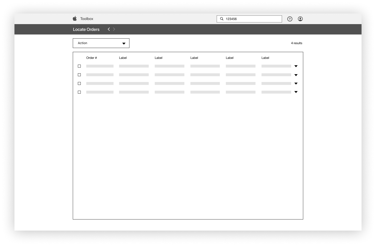
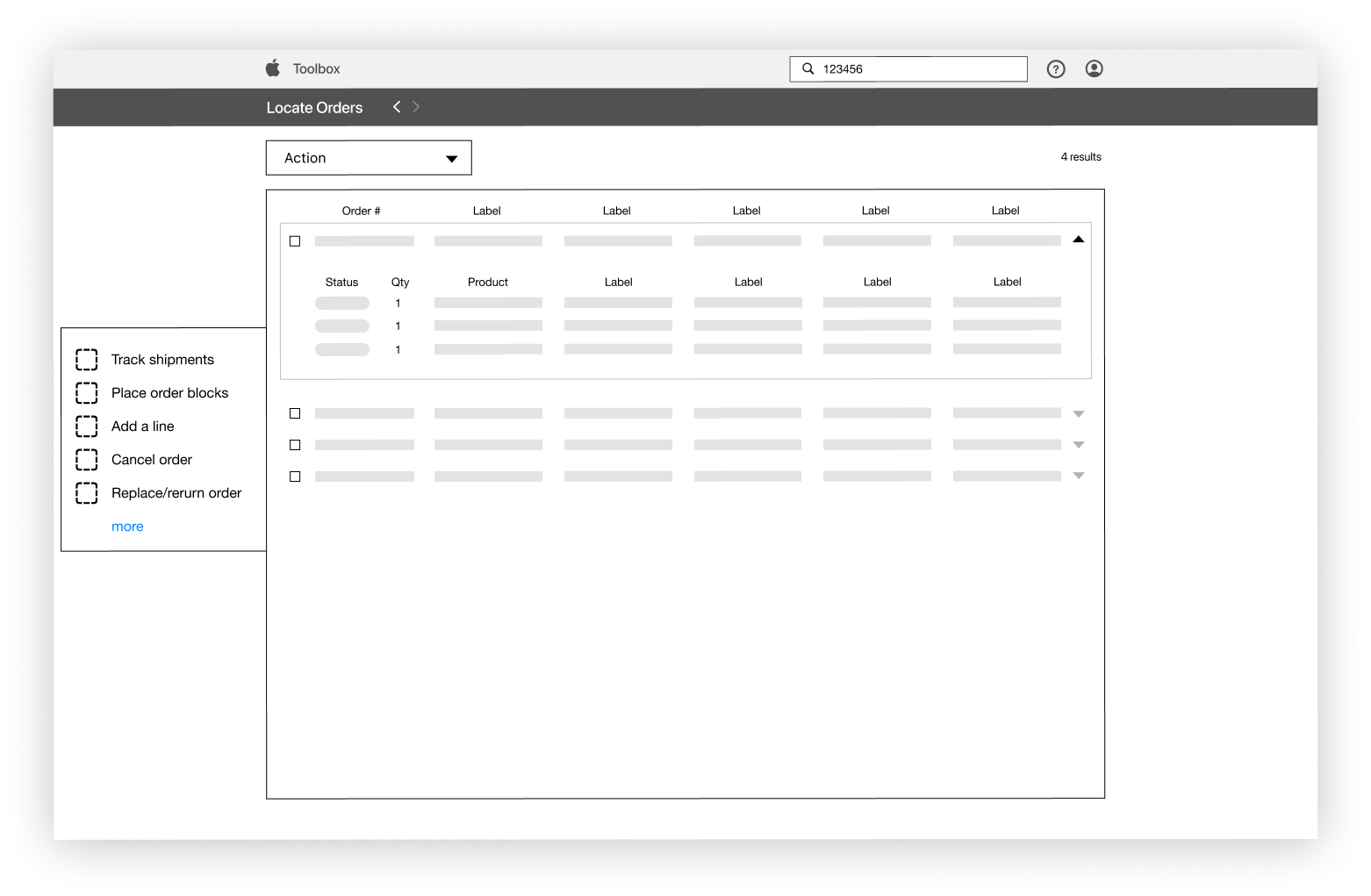
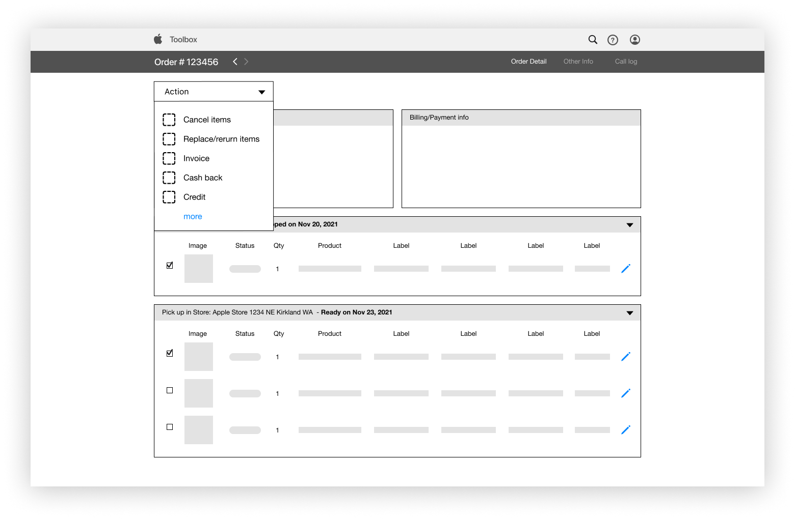
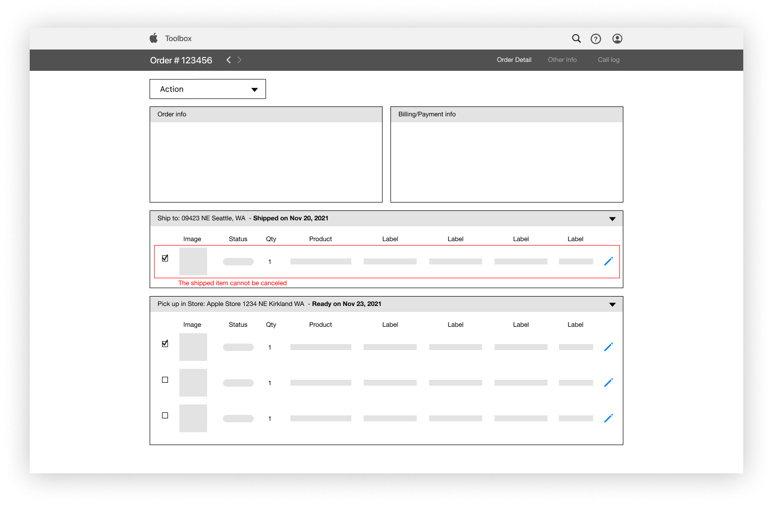
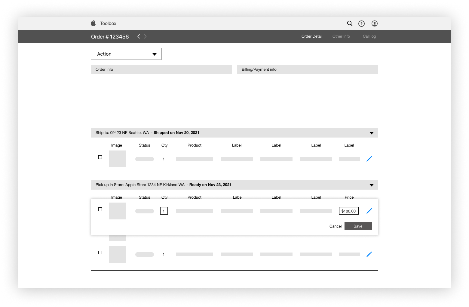
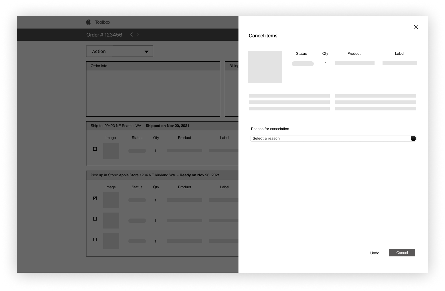
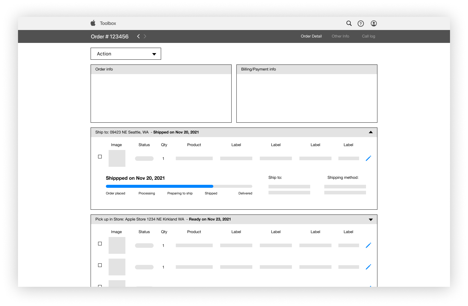
WIREFRAMES
Wireframing it out
THAT’S ALL FOLKS!
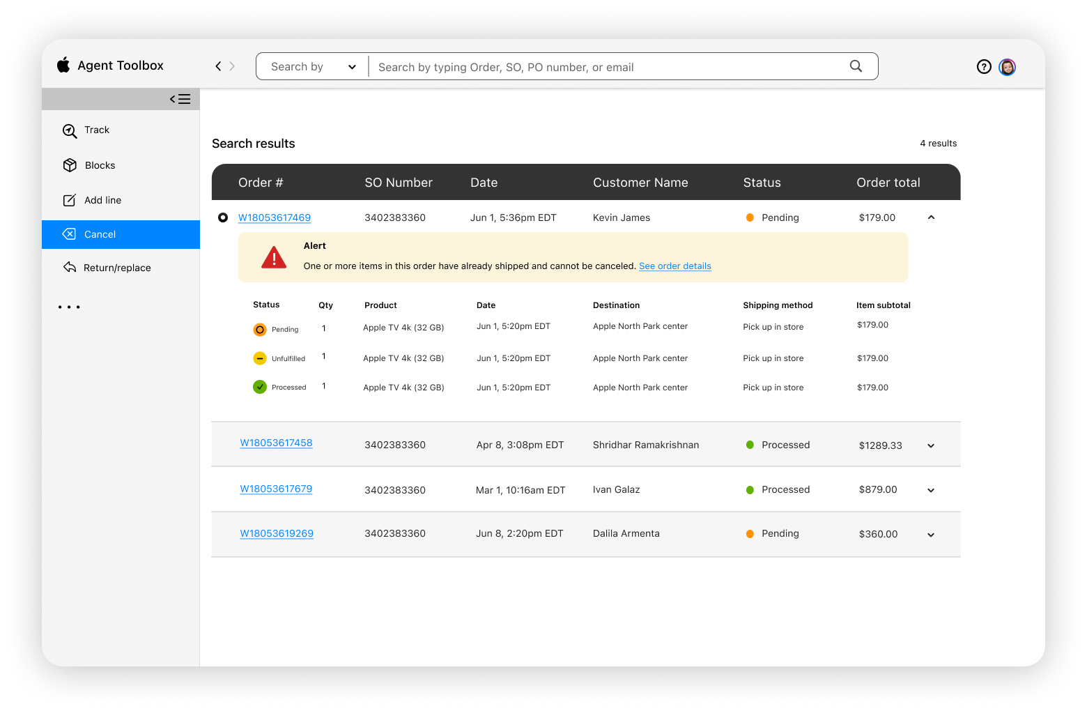
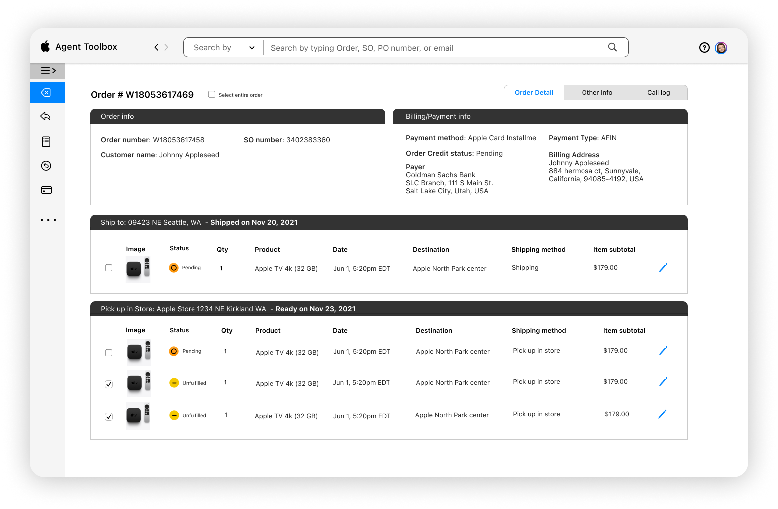
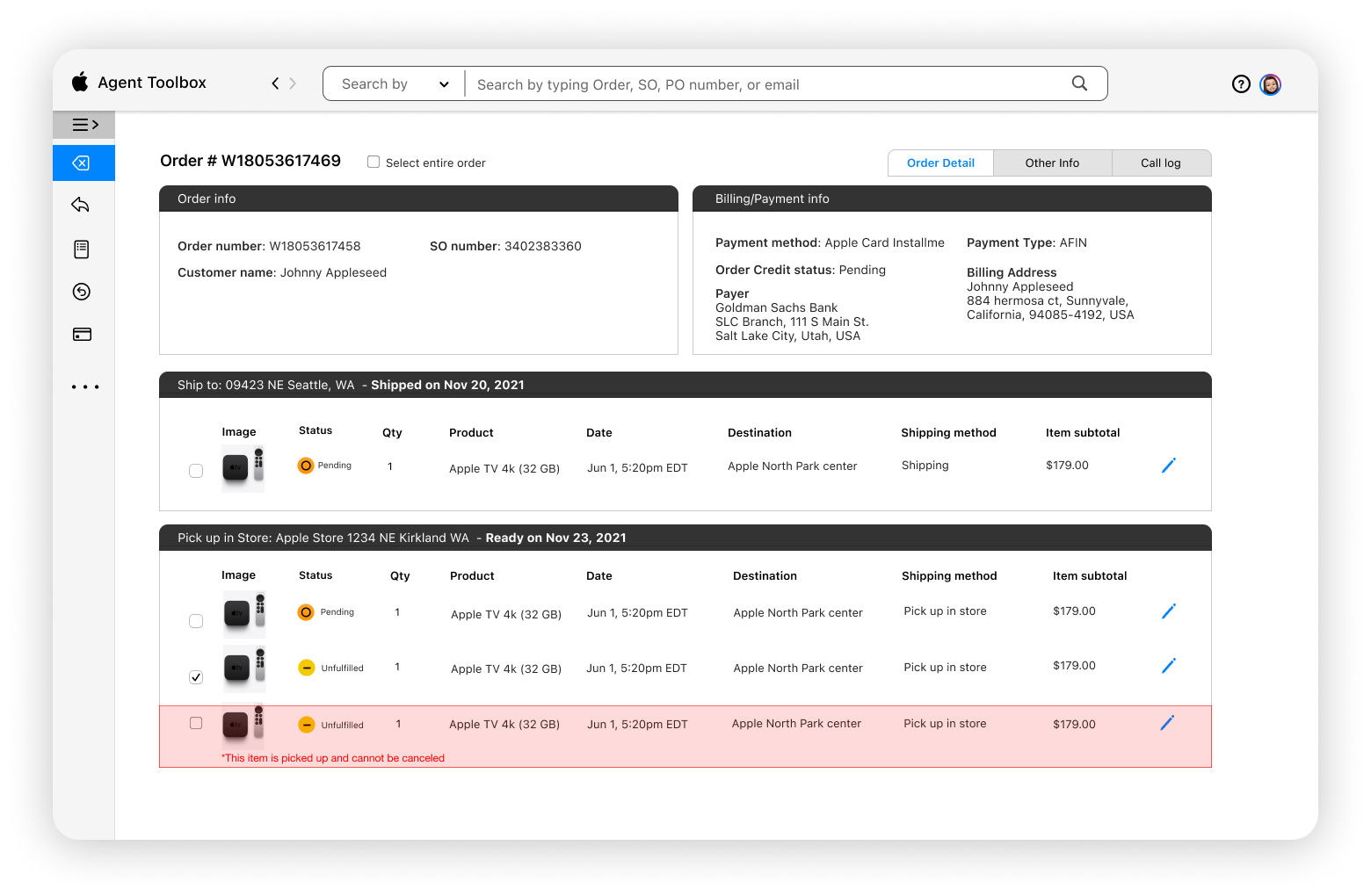
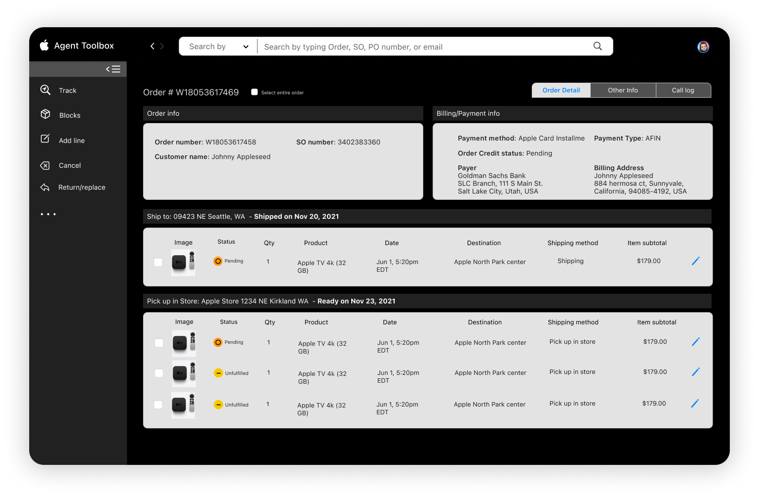
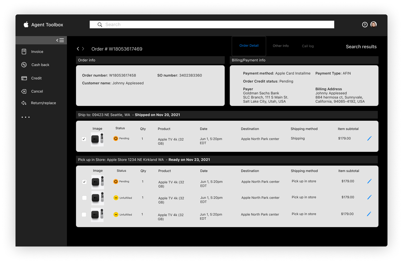
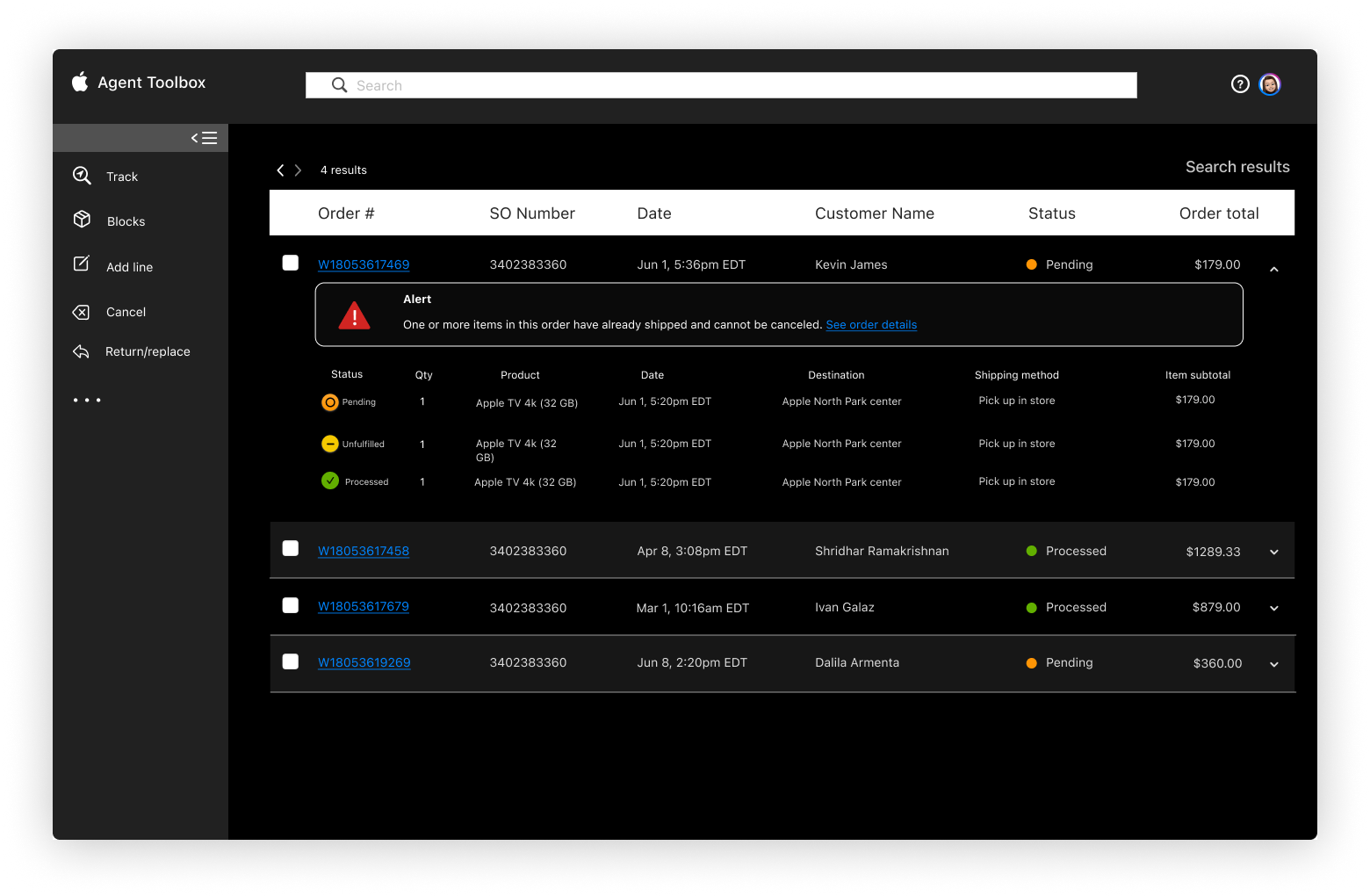
We built our final design around the expanded side-bar menu. The side bar will be included in each step of the experience without impeding the workflow.
To conclude…